Preview image. Unlock full-res
A graphic-device page introducing the Dark Hawk Gradient, a restrained tonal blue hawk motif for editorial layouts.
Summary
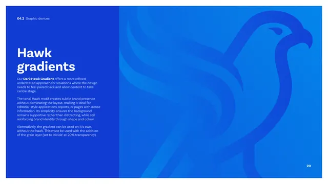
The Dark Hawk Gradient page: a blue copy panel describes a restrained tonal hawk motif for editorial use, with a large subtle blue-on-blue hawk filling the right half.
Visual description
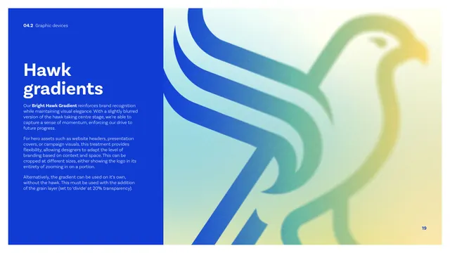
A tall cobalt panel on the left carries a white "Hawk gradients" heading and copy describing the "Dark Hawk Gradient" as a refined, understated treatment for dense or editorial layouts where content should lead, again usable as a gradient alone with the 20 percent divide grain layer. The right two-thirds is a tonal blue field where the enlarged hawk appears as a barely-there darker-and-lighter blue silhouette with subtle grain, cropped off the right edge. The effect is monochromatic and quiet, the inverse of the bright version on the previous page.
Key takeaway
The deliberate low-contrast, single-hue counterpart to the bright hero gradient, so the same motif can sit behind text-heavy pages without competing. Documenting both modes side by side teaches when to use which.
Reuse notes
Use this restrained version behind reports, content-dense pages, or wherever the bright gradient would overpower copy. Together with page 19 it gives the brand a loud and a quiet background option from one shape.