Preview image. Unlock full-res
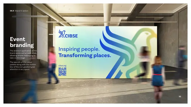
An environmental application page showing a large gradient-hawk event wall with the tagline and QR code in a busy concourse.
Summary
The event branding page: a large freestanding wall in a concrete concourse carries the bright gradient hawk, the CIBSE lockup, the tagline and a QR code, with blurred passers-by suggesting scale and motion.
Visual description
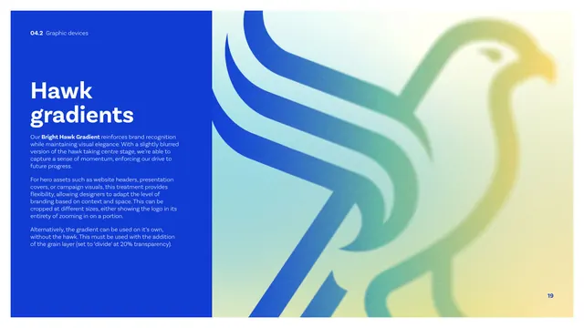
A photographic mockup shows a big illuminated wall panel standing in an industrial concrete concourse. The panel runs the bright blue-to-green-to-yellow hawk gradient with the cobalt CIBSE lockup top-left, the "Inspiring people. Transforming places." tagline (blue and white) at center-left, a "cibse.org" line and a QR code below. People walk past in motion-blur, conveying a busy public setting. The left margin carries an "Event branding" heading and short copy about the abstract brand application working at large scale and the warmth plus motion-blur of the icon gradient grabbing attention. The hawk gradient is used here at its largest, most abstract scale.
Key takeaway
Pushing the hawk gradient to maximum scale and abstraction for an event wall, letting a simple tagline plus QR carry the message, which proves the gradient device reads from a distance and in a crowd. The blurred figures in the mockup sell the real-world scale.
Reuse notes
A reference for large-format and event environmental graphics. The lesson is restraint at scale: one big gradient, the tagline, a QR, nothing more. The motion-blur in this still is photographic context, not an animation cue.