Preview image. Unlock full-res
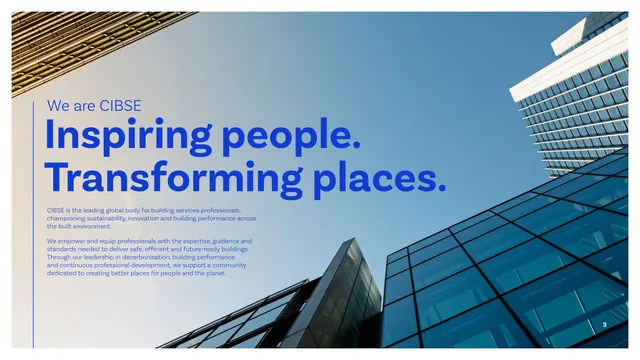
An intro statement page with a giant blue "Inspiring people. Transforming places." headline over a low-angle glass-tower photo.
Summary
The "We are CIBSE" opener: an oversized two-line blue tagline headline overlaid on a full-bleed upward shot of glass office towers, with a short mission paragraph beneath.
Visual description
A full-bleed photograph looks straight up the corner of two glass-and-steel office towers into a clear blue sky. Over the lighter sky area, a small "We are CIBSE" eyebrow sits above the oversized two-line headline "Inspiring people. Transforming places." in heavy blue sans-serif. Two short paragraphs of supporting body copy in blue sit lower-left, describing CIBSE as the global body for building-services professionals. A thin vertical rule anchors the left margin. The blue type reads directly on the bright photo without a panel.
Key takeaway
Setting the brand tagline at display scale directly over architectural photography, letting the building's own sky negative-space carry the text instead of a color block. It feels confident and editorial.
Reuse notes
Use for a mission or about opener when you have a photo with a clean, light area for type. Risky on busy images; here it works only because the upper sky is uniform enough for blue text to stay legible.