Preview image. Unlock full-res
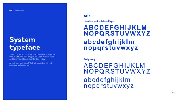
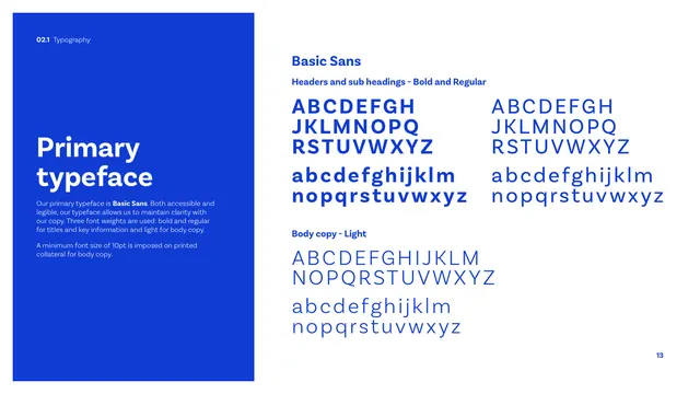
The fallback typeface page specifying Arial for when Basic Sans is unavailable, with bold and regular alphabet specimens in blue.
Summary
The system typeface page: a blue panel names Arial as the fallback when Basic Sans is unavailable, with bold (headers) and regular (body) full alphabet specimens shown in cobalt.
Visual description
A tall cobalt panel on the left carries a white "System typeface" heading and light copy stating Arial is the system font when the primary face is unavailable, in two weights (bold for titles and key info, regular for body), again with a 10pt minimum for printed body. The right side, on white and labelled "Arial," shows a "Headers and sub headings" block with bold full upper and lowercase alphabets, and a "Body copy" block with regular full upper and lowercase alphabets, all in cobalt blue. The layout mirrors the primary typeface page exactly.
Key takeaway
Documenting the office/system fallback with the same rigour and layout as the brand face, so substitutions stay consistent. Mirroring the previous page's structure makes the primary-vs-system relationship obvious.
Reuse notes
The companion to the primary typeface page. Including a ubiquitous fallback like Arial is practical for membership bodies whose materials are often produced in Office by non-designers.
From this deck: CIBSE Brand Guidelines - System typeface
View deck













More like this






Keep what you find
A free account saves references to boards and can send you a weekly email of picks based on what you save.
To see every result, go Pro.