
Preview image. Unlock full-res
A graphic-device page presenting all four ready-made gradient backgrounds (bright, bright-hawk, dark, dark-hawk) in a labelled two-by-two grid.
Summary
The gradient asset suite: a blue copy panel on when to use each, beside a labelled two-by-two grid showing Bright Gradient, Bright Hawk Gradient, Dark Gradient and Dark Hawk Gradient.
Visual description
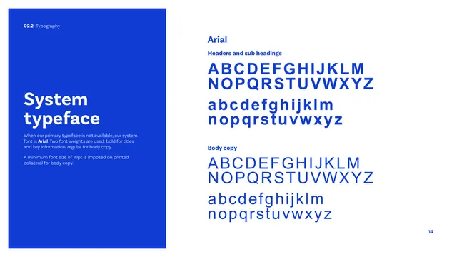
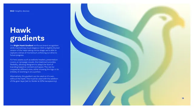
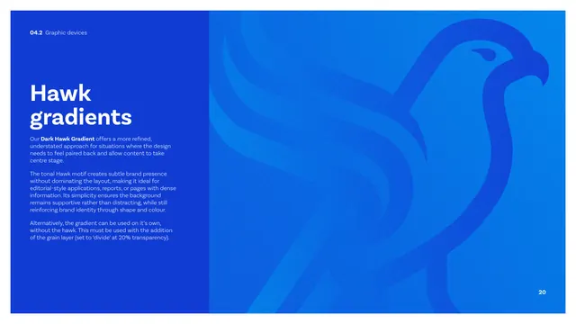
A tall cobalt panel on the left carries a white "Gradient asset suite" heading and copy on choosing assets by audience, vibrant gradients for bold high-impact hero areas and tonal editorial backgrounds for restraint. The right side is a two-by-two grid of large rectangles, each titled: "Bright Gradient" (a soft yellow-mint-blue wash), "Bright Hawk Gradient" (that wash with the multi-color hawk), "Dark Gradient" (a flat blue field), and "Dark Hawk Gradient" (a blue field with the tonal hawk). Together they summarise the four ready-made backgrounds defined on the prior pages.
Key takeaway
Collecting all derived background assets onto one contact-sheet page with consistent labels, so designers can pick from a known set rather than building gradients themselves. It turns the device into a reusable library.
Reuse notes
A useful summary page whenever a brand ships a fixed set of background assets. The labelled grid doubles as a quick-pick reference and as documentation of exactly which gradients are sanctioned.
From this deck: CIBSE Brand Guidelines - Gradient asset suite
View deck















More like this




Keep what you find
A free account saves references to boards and can send you a weekly email of picks based on what you save.
To see every result, go Pro.