Preview image. Unlock full-res
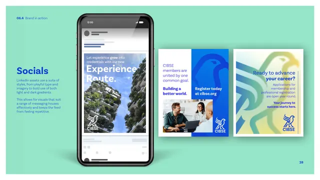
A social application page on a mint background showing LinkedIn assets, a phone feed mockup plus two static cards in light and dark gradient styles.
Summary
The LinkedIn social page: a mint-green field holds a phone showing a feed post plus two static post cards, one on dark blue and one on the bright gradient, demonstrating both light and dark treatments.
Visual description
A solid mint-green background frames the assets. A phone mockup at left shows a LinkedIn-style feed post: a green-terraced-tower photo with the white headline "Experience Route" and a reversed white CIBSE lockup, with greyed feed UI above and below. To the right sit two square post cards: one with "CIBSE members are united by one common goal / Building a better world / Register today at cibse.org" set over a blue field with a dark tonal hawk and an inset photo, and one reading "Ready to advance your career?" on the bright mint-to-yellow gradient with the reversed hawk lockup. The left margin carries a blue "Socials" heading and short copy on using a suite of light and dark gradient styles. The whole page sits in the secondary mint, not blue.
Key takeaway
Showing one platform's posts in both a dark-gradient and a light-gradient treatment so the feed stays varied and non-repetitive, exactly as the copy advises. Staging the whole page on the secondary mint demonstrates the palette beyond the dominant blue.
Reuse notes
The first of three social pages (LinkedIn). A good reference for giving a social brand more than one post template so feeds do not feel monotonous; the light/dark pairing is the reusable idea.
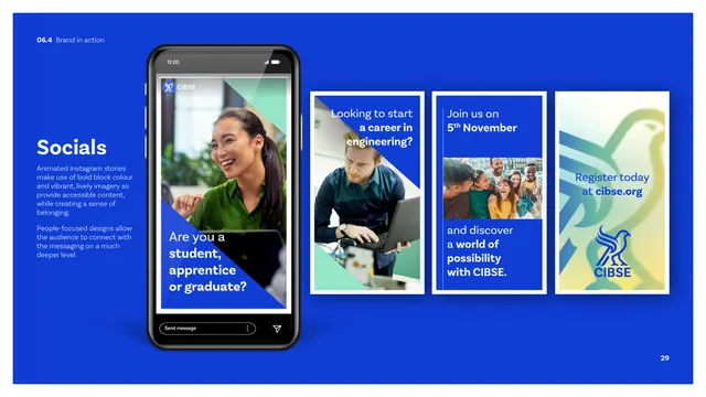
From this deck: CIBSE Brand Guidelines - Socials (LinkedIn)
View deck









More like this




Keep what you find
A free account saves references to boards and can send you a weekly email of picks based on what you save.
To see every result, go Pro.