Preview image. Unlock full-res
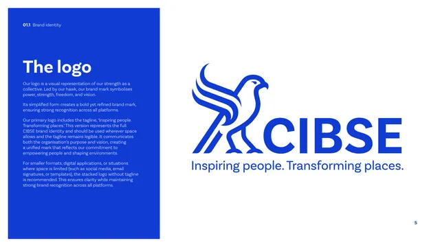
Logo introduction with a blue left text panel and the full CIBSE hawk-plus-wordmark primary lockup displayed large on white.
Summary
The logo introduction: a tall blue text panel on the left explains the hawk-led mark, while the full primary CIBSE lockup with tagline sits large and centered on white.
Visual description
The left third is a solid cobalt panel with a white "The logo" heading and four short light-blue paragraphs explaining that the mark is led by the hawk and that a primary (with tagline) and stacked (without tagline) version exist. The right two-thirds shows the primary lockup at large scale on white: the geometric monoline hawk to the left of a heavy "CIBSE" wordmark in cobalt, with the tagline "Inspiring people. Transforming places." underlined beneath the wordmark. The hawk is rendered in clean single-weight strokes facing right.
Key takeaway
Presenting the hero lockup at generous scale on plenty of white so the mark's construction reads clearly, paired with a narrow color rationale panel rather than crowding annotations around the logo.
Reuse notes
Standard "here is the logo" spread for any identity guideline. The split of explanatory panel plus oversized clean lockup is a reliable default for the first logo page.
From this deck: CIBSE Brand Guidelines - The logo
View deck












More like this



Keep what you find
A free account saves references to boards and can send you a weekly email of picks based on what you save.
To see every result, go Pro.