Preview image. Unlock full-res
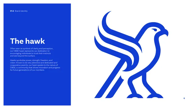
A page dedicated to the hawk symbol, with a blue text panel of meaning and a large monoline hawk mark filling the right.
Summary
The hawk symbol page: a tall blue copy panel explains what the hawk stands for while the geometric hawk mark is shown very large in cobalt on white.
Visual description
A tall solid cobalt panel runs down the left, holding a white "The hawk" heading and two light paragraphs about the hawk symbolising clarity, perception, power, strength, freedom and vision. The right two-thirds is taken up by a single oversized hawk mark in cobalt blue on white: a stylized standing raptor built from bold monoline strokes, wings swept up and back, sharp downturned beak, legs and talons fully drawn. At this scale the geometric stroke construction and consistent line weight are clearly visible.
Key takeaway
Giving the standalone symbol its own full page at maximum scale, so the mark's geometry and craft can be appreciated independent of the wordmark. Pairing it with the symbolic rationale builds meaning.
Reuse notes
Use when a brand mark carries narrative weight worth a dedicated reveal page. The oversized-mark-plus-meaning-panel layout works for any logo with a distinctive symbol.
From this deck: CIBSE Brand Guidelines - The hawk
View deck















More like this





Keep what you find
A free account saves references to boards and can send you a weekly email of picks based on what you save.
To see every result, go Pro.