Preview image. Unlock full-res
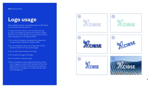
A logo misuse page pairing a numbered blue rules panel with a two-by-three grid of crossed-out incorrect logo treatments.
Summary
The logo misuse page: a blue panel lists six numbered "do not" rules, and a two-by-three grid of bordered boxes each shows an incorrect logo treatment marked with a circled cross.
Visual description
A tall cobalt panel on the left carries a white "Logo usage" heading and a numbered list of six prohibitions (no transparency change, no recolour, no drop shadow, no angle change, no stretch/skew, take care over imagery). The right side is a two-by-three grid of thin-outlined boxes, each topped by a small circled-X icon and showing one violation: faded/transparent logo, recoloured green logo, drop-shadowed logo, rotated logo, stretched logo, and the logo placed over busy metallic imagery. A page number sits bottom-right.
Key takeaway
The tight pairing of a numbered rules list with a matching crossed-out example grid, so each written rule has a visual counterpart. The circled-X badge on every box reads as "forbidden" instantly.
Reuse notes
The canonical logo-don'ts page. Reuse the rules-panel-plus-example-grid structure for any brand; the number of boxes flexes to the number of common misuses worth warning against.
From this deck: CIBSE Brand Guidelines - Logo usage donts
View deck

















More like this





Keep what you find
A free account saves references to boards and can send you a weekly email of picks based on what you save.
To see every result, go Pro.