Preview image. Unlock full-res
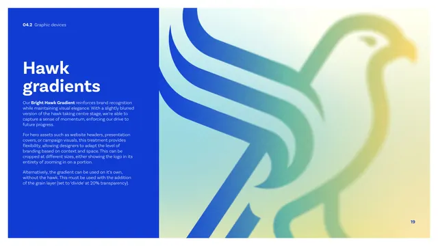
A graphic-device page introducing the Bright Hawk Gradient, with a blue copy panel beside a large soft multi-color hawk treatment.
Summary
The Bright Hawk Gradient page: a blue copy panel explains the vibrant blurred-hawk hero treatment while a large grain-textured multi-color hawk fills the right half.
Visual description
A tall cobalt panel on the left carries a white "Hawk gradients" heading and copy describing the "Bright Hawk Gradient" as a slightly blurred hawk that captures momentum, suited to hero assets like website headers and presentation covers, croppable, and usable as a gradient alone with a grain layer set to "divide" at 20 percent. The right two-thirds shows the hawk mark enlarged and softened into a blue-to-mint-to-yellow gradient with visible grain, cropped so the bird runs off the right edge. This is the same hero treatment used on the cover and thank-you pages.
Key takeaway
A defined "bright" hero version of the logomark as a soft, grainy, croppable gradient asset, with explicit rules (grain on divide at 20 percent) so the effect is reproducible rather than ad hoc.
Reuse notes
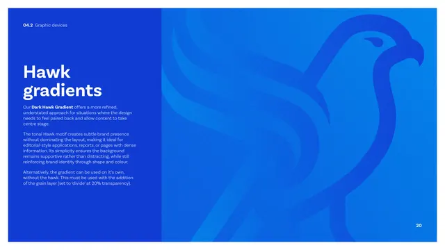
Pairs with the dark hawk gradient on the next page as a two-mode system. Reach for the bright version on covers and campaign hero areas where high energy is wanted; the grain spec keeps it consistent across designers.
From this deck: CIBSE Brand Guidelines - Hawk gradients (bright)
View deck


















More like this






Keep what you find
A free account saves references to boards and can send you a weekly email of picks based on what you save.
To see every result, go Pro.