Preview image. Unlock full-res
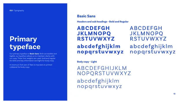
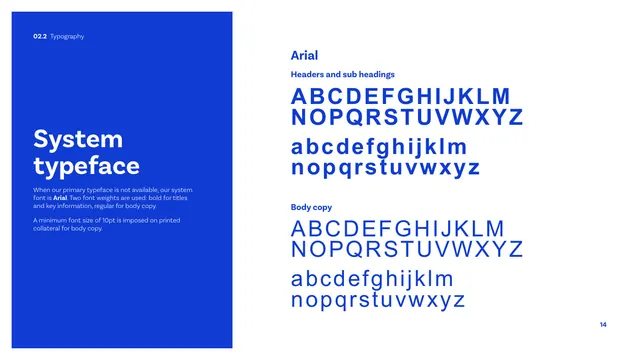
The primary typeface page specifying Basic Sans, with full bold, regular and light alphabet specimens in blue on white.
Summary
The primary typeface page: a blue panel names Basic Sans and sets a 10pt minimum, while the right shows full uppercase and lowercase specimens in Bold, Regular and Light.
Visual description
A tall cobalt panel on the left carries a white "Primary typeface" heading and light copy stating the primary face is Basic Sans, used in three weights (bold and regular for titles and key info, light for body), with a 10pt minimum on printed body copy. The right side, on white, shows "Basic Sans" labelled specimens in cobalt: a Headers row pairing Bold and Regular full alphabets (A-Z and a-z) side by side, and a "Body copy - Light" block beneath with its own full upper and lowercase alphabet. Basic Sans is a clean geometric grotesque with even stroke weight.
Key takeaway
Showing the three working weights as complete alphabets in the brand's own blue, so designers see exact letterforms and the regular-vs-bold contrast at a glance, with the minimum-size rule stated plainly in the side panel.
Reuse notes
Standard primary-typeface spec page. The blue-panel-plus-specimen layout matches the rest of the deck's content pages; reuse it for any face where weight differences need to be demonstrated.
From this deck: CIBSE Brand Guidelines - Primary typeface
View deck














More like this







Keep what you find
A free account saves references to boards and can send you a weekly email of picks based on what you save.
To see every result, go Pro.