Preview image. Unlock full-res
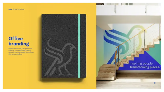
An environmental application page showing a debossed-hawk notebook on yellow and a gradient hawk mural over an office staircase.
Summary
The office branding page: a dark notebook with a debossed hawk on a yellow field beside an interior photo of a stairwell wall carrying a large gradient hawk mural and the tagline.
Visual description
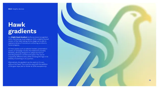
The page splits in two. The left half is a saturated yellow field with a "Office branding" heading in blue, a short caption about bright colour livening architecturally strong spaces, and a photographic mockup of a charcoal leather notebook, mint elastic band, embossed/debossed tonal hawk on its cover. The right half is an interior photograph of a timber-and-cable staircase where the wall behind carries a large blue-to-green-to-yellow gradient hawk and, on a blue block at the base, the white/blue "Inspiring people. Transforming places." tagline. The environmental graphic uses the bright hawk gradient at architectural scale.
Key takeaway
Taking the hawk into physical space two ways at once: a tactile, debossed, almost-invisible mark on a premium notebook, and the loud full-colour gradient hawk as a wall mural. The contrast shows the motif working both subtly and boldly in the same environment.
Reuse notes
A reference for environmental and merchandise branding. The deboss-for-objects, gradient-mural-for-walls pairing is a reusable approach for fitting a single mark to very different physical surfaces. (Header reads 06.4 though the contents index lists office branding as 06.5.)
From this deck: CIBSE Brand Guidelines - Office branding
View deck















More like this







Keep what you find
A free account saves references to boards and can send you a weekly email of picks based on what you save.
To see every result, go Pro.