Preview image. Unlock full-res
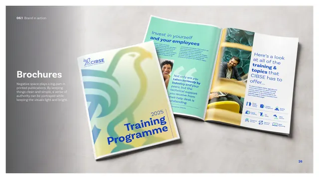
A brochure application page showing a gradient-hawk training programme cover and an open spread, mocked up on a grey surface.
Summary
The brochure application page: a "Training Programme 2025" cover with a large gradient hawk and an open interior spread, photographed on a grey surface with a "Brochures" caption stressing negative space.
Visual description
A photographic mockup on a soft grey surface shows two printed pieces. The cover, in the bright mint-to-yellow hawk gradient, carries a small CIBSE lockup top-left and "2025 Training Programme" in blue at the lower-right. The open spread beside it shows an editorial layout: a mint panel with a blue/black headline and pull-quote, a photo of a man reading, and a white right page with a headline, body copy, a row of small two-tone topic icons and an image. A "Brochures" heading and short white caption sit far left, noting negative space and a clean, light, authoritative feel. The interior leans on generous white space.
Key takeaway
Carrying the bright hawk gradient onto a publication cover while keeping interiors airy and white, so the brand has presence on the outside and readability inside. The small two-tone topic icons reappear here, showing the icon set in real editorial use.
Reuse notes
A good reference for membership or training publications. The loud-cover, quiet-interior split plus the reuse of the icon system shows how the kit's parts combine in long-form print.
From this deck: CIBSE Brand Guidelines - Brochures
View deck









More like this



Keep what you find
A free account saves references to boards and can send you a weekly email of picks based on what you save.
To see every result, go Pro.