Preview image. Unlock full-res
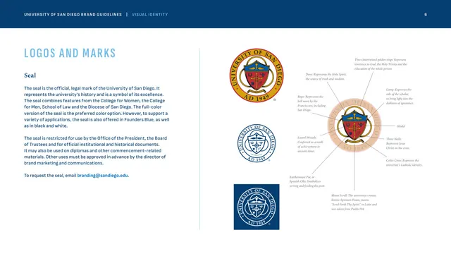
The official seal shown in full-color, one-color and reversed versions beside an annotated diagram decoding each heraldic element.
Summary
The seal page, presenting the university's formal heraldic mark in three color treatments and a radial callout diagram that explains every symbol in the crest.
Visual description
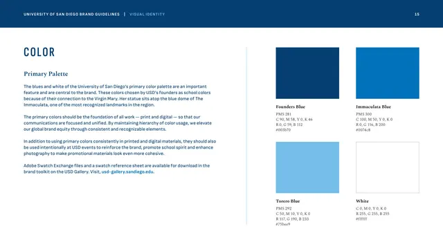
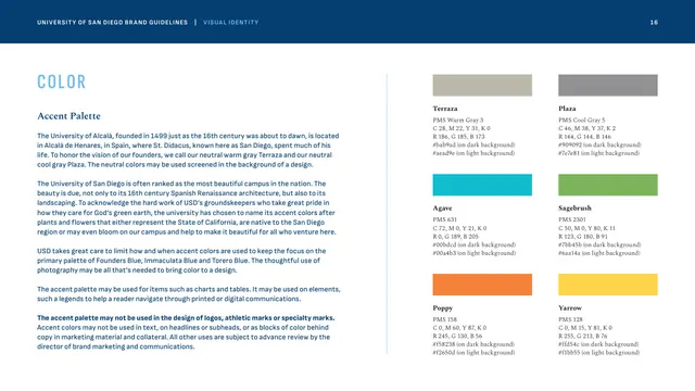
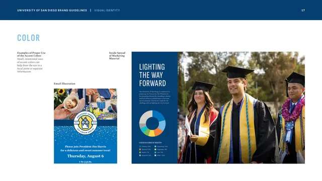
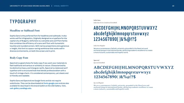
Left column: "LOGOS AND MARKS" caps, a "Seal" Spectral subhead, and body copy describing the seal's history and its restricted use, with a bright-blue email link. The center column stacks three versions of the round seal: full-color (red, gold and blue crest with "UNIVERSITY OF SAN DIEGO / AD 1949" around the ring), a one-color blue line version, and a reversed white version on a Founders Blue square. To the right, the crest is enlarged at low opacity and surrounded by thin leader lines pointing to small serif-italic callouts naming each element (dove, rope, laurel wreath, three intertwined rings, lamp, shield, three nails, Celtic cross, earthenware pot, motto scroll). It is the only page where red and gold appear prominently.
Key takeaway
The annotated radial callout treatment turns a dense heraldic mark into a teaching diagram, justifying the symbol's gravity and history. Pairing it with the three sanctioned color treatments handles both meaning and application on one spread.
Reuse notes
A strong template for any organization with a formal seal or crest (universities, government bodies, legacy institutions) that wants to document both restricted usage and symbolic meaning. The faint enlarged mark with leader-line callouts is directly reusable for explaining any complex emblem.
From this deck: The university seal and its symbolism
View deck




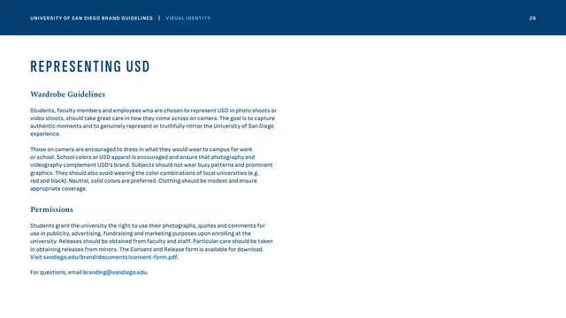
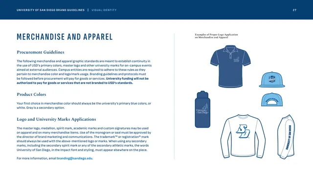
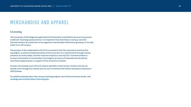
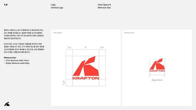
More like this









Keep what you find
A free account saves references to boards and can send you a weekly email of picks based on what you save.
To see every result, go Pro.