Preview image. Unlock full-res
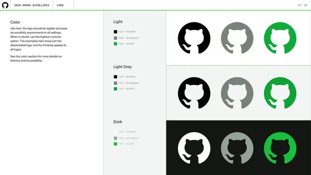
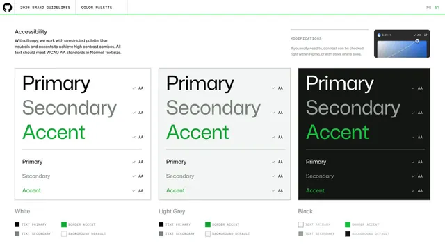
Light page showing the Invertocat in primary, secondary, and accent colors across Light, Light Grey, and Dark background themes for accessibility.
Summary
A logo-color page mapping the Invertocat onto three background themes (Light, Light Grey, Dark), each with primary, secondary, and accent color treatments, framed around accessibility and contrast.
Visual description
Light background split into a narrow text column and a wide swatch grid. The left column explains the logo must be legible and pass accessibility in all settings, defaulting to highest contrast. Three labeled rows (Light, Light Grey, Dark) each show the Invertocat three times: text-primary (black or white), text-secondary (grey), and text-accent (green), with a small key listing those swatches. The Dark row inverts to a black background with a white primary mark.
Key takeaway
Organizing logo color by background theme and by token role (primary / secondary / accent) in a single matrix, with the explicit "when in doubt use highest contrast" rule. It ties brand color to accessibility cleanly.
Reuse notes
Strong template for documenting logo color in light and dark modes. The token-role columns (primary/secondary/accent) generalize to any themed design system.
From this deck: Logo color across themes
View deck














More like this

Keep what you find
A free account saves references to boards and can send you a weekly email of picks based on what you save.
To see every result, go Pro.