Preview image. Unlock full-res
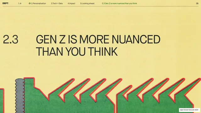
Pale-yellow sub-section divider with a large dark 2.3 and all-caps headline, and the recurring green-and-red torn-paper sawtooth band across the bottom.
Summary
The pale-yellow sub-section divider for 2.3: a large dark "2.3" beside the all-caps headline "GEN Z IS MORE NUANCED THAN YOU THINK", with the deck's recurring green-and-red torn-paper sawtooth band along the bottom.
Visual description
Warm pale-yellow ground with the standard nav header (2.Personalisation active with green leaf glyph, sub-section label "2.3 Gen Z is more nuanced than you think" at right, page 26). The number "2.3" in dark sans-serif sits to the left of a two-line dark all-caps grotesque headline, center-left. The lower third is the same horizontal row of flat green hand-cut sawtooth/arrow shapes outlined in bright red, with a grey ribbed screw-head shape at far left, bleeding off the bottom. Open yellow space above.
Key takeaway
The locked sub-section divider template again: only the number, headline and nav label change between dividers, making the deck's structure self-evident. This repetition is the system working as intended.
Reuse notes
Drop-in sub-section marker for a chaptered report. Keep the graphic band and layout fixed and vary only the text. Useful as a pacing beat between dense content slides.
From this deck: Sub-section 2.3 divider, Gen Z is more nuanced than you think
View deck