Preview image. Unlock full-res
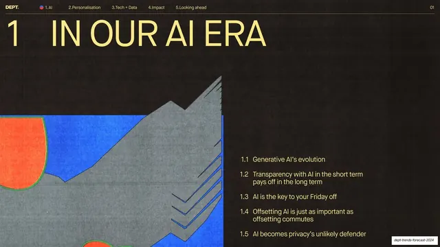
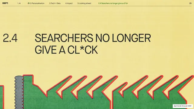
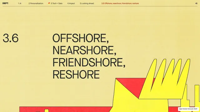
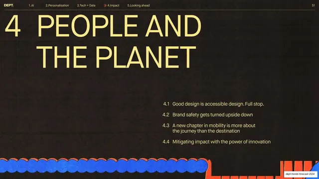
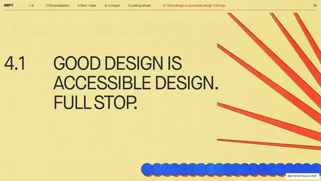
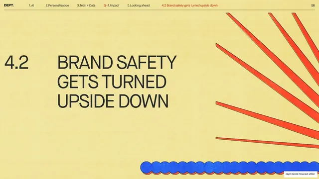
Butter-yellow section divider with a numbered oversized all-caps headline and the recurring riso red rays and blue scalloped strip.
Summary
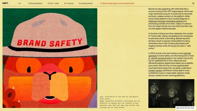
A sub-section title card matching the deck's divider template: a small "4.2" beside an oversized all-caps "BRAND SAFETY GETS TURNED UPSIDE DOWN" on a warm yellow field.
Visual description
Butter-yellow textured background. The running header tracks across the top on a hairline rule with the active sub-section "4.2 Brand safety gets turned upside down" highlighted in red. A small "4.2" sits at left of a three-line black grotesque all-caps headline filling the center-left. The same risograph motifs recur: a sunburst of red ribbed rays sweeping in from the top-right corner, and a horizontal blue scalloped strip with a thin red underline along the bottom edge.
Key takeaway
The consistency itself: this is the identical divider grammar from the 4.1 slide with only the number and words changed, which is exactly what makes a long deck feel intentional. Two fixed riso motifs plus one big statement.
Reuse notes
Reuse as part of the divider set for a sectioned report deck. Keep the corner ray-burst and bottom scalloped strip fixed across all dividers; vary only the index and headline so the rhythm holds.
From this deck: 4.2 Brand safety gets turned upside down section divider
View deck