Preview image. Unlock full-res
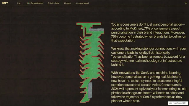
Dark slide with a tall green-and-red torn-paper graphic centered and three paragraphs of yellow body copy on the right making the case that personalisation is finally real.
Summary
A dark body-copy slide that centers a tall green torn-paper graphic (outlined in red, with grey screw-head caps top and bottom) against three paragraphs of yellow running text on personalisation becoming real.
Visual description
Near-black textured ground with the standard nav header (2.Personalisation active, page 19) on a thin yellow rule. A single vertical collage element stands left of center: a flat green hand-cut shape resembling a spine or zipper, outlined in bright red, capped at top and bottom by grey ribbed screw-head shapes. To its right, three paragraphs of yellow sans-serif body copy with a few underlined inline stats ("71% of consumers", "76% become frustrated"). No large headline; this is a continuation/explanation slide following the section divider.
Key takeaway
Letting one tall, oddly tactile collage object anchor an otherwise text-only slide so the body copy does not float in empty space. The recurring green-red-grey graphic language keeps the dark section visually consistent across slides.
Reuse notes
A clean way to handle a copy-heavy slide in a design-forward deck: one strong abstract graphic plus a single column of text. Best used as a follow-on to a divider within the same colored section. The collage motif is bespoke; substitute your own recurring graphic element to get the same effect.
From this deck: Personalisation gets real (vertical collage + body)
View deck












More like this





Keep what you find
A free account saves references to boards and can send you a weekly email of picks based on what you save.
To see every result, go Pro.