Preview image. Unlock full-res
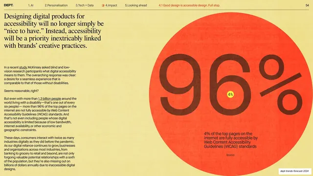
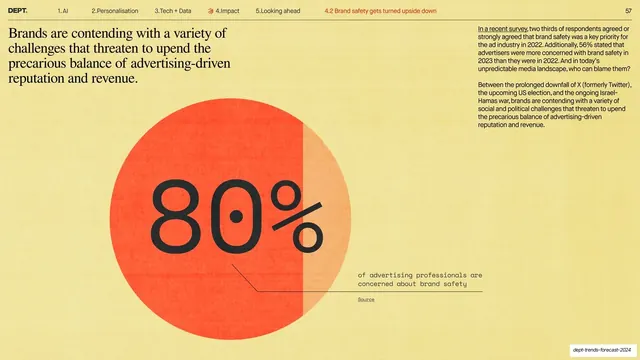
A huge orange disc carrying an oversized 96% stat, paired with a serif lead and a column of supporting body copy on the left.
Summary
A statistic slide built around one giant orange circle: an oversized "96%" fills it, with a tiny "4%" counter-stat nested inside, and a serif headline plus running body copy carry the argument on the left.
Visual description
Warm yellow background, standard running header on a hairline rule with the active sub-section in red. The right two-thirds is a large orange disc; inside it a very large dark-brown "96%" is set, with a small yellow dot reading "4%" tucked into the middle and a short caption near the bottom of the circle explaining that only 4% of top pages are fully WCAG accessible, above a small "Source" link. The left column opens with a four-line serif lead ("Designing digital products for accessibility will no longer simply be nice to have...") followed by several short paragraphs of small sans-serif body copy with underlined inline links.
Key takeaway
Encoding the headline number as the hero shape: the 96% is the image. Nesting the inverse "4%" inside the same circle tells the whole story in one glance. The serif-lead-over-sans-body split keeps a dense argument readable.
Reuse notes
A clean template for any single-stat slide in a research or trends report. The nested counter-stat trick works whenever a figure has a meaningful complement (96/4, 80/20). Needs a genuinely striking number to justify the scale.
From this deck: 96% accessibility stat in a giant circle
View deck


























More like this





Keep what you find
A free account saves references to boards and can send you a weekly email of picks based on what you save.
To see every result, go Pro.