Preview image. Unlock full-res
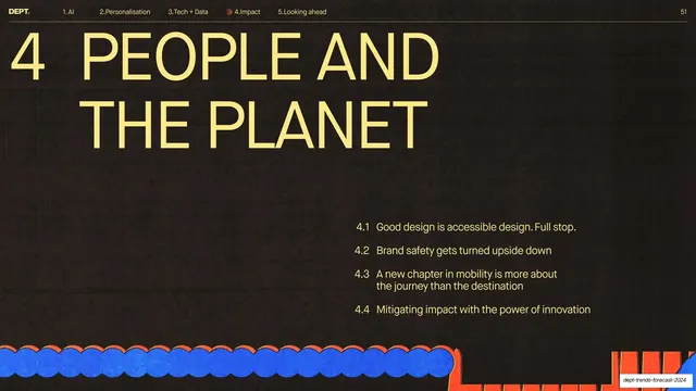
Dark near-black chapter divider with a huge yellow all-caps headline, a 4 index number, an indented subsection list, and a blue-and-red scalloped illustration along the bottom.
Summary
The major chapter divider for section 4, "PEOPLE AND THE PLANET", flipped to a dark background with a huge yellow headline and an indented list of the four subsections to come.
Visual description
Near-black textured (#241F1A) full-bleed, a tonal flip from the pale-yellow content slides. The hairline header runs in light type: "DEPT." wordmark, the section nav with "4.Impact" active, and page "51". Top-left, a large "4" index number sits beside a two-line oversized all-caps yellow grotesque headline, "PEOPLE AND THE PLANET". The lower-right quadrant lists the four subsections in light type with decimal numbers (4.1 Good design is accessible design. Full stop. / 4.2 Brand safety gets turned upside down / 4.3 A new chapter in mobility... / 4.4 Mitigating impact with the power of innovation). Along the bottom edge runs a flat illustration of blue scalloped/cloud forms beside red spiky shapes.
Key takeaway
Marking a top-level chapter (versus a subsection) by inverting to a dark slide and listing the chapter's subsections like a mini agenda. The tonal flip signals hierarchy instantly, and the embedded contents list orients the reader before the section starts.
Reuse notes
Use dark inverted slides for major chapter breaks and light slides for subsection dividers, so the two levels of structure are visually distinct. The agenda list doubles as a section table of contents. Keep the bright illustration to anchor the otherwise dark, empty field.
From this deck: People and the Planet chapter divider
View deck