Preview image. Unlock full-res
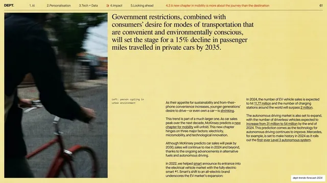
A serif statement headline sits top-right with a full-height motion-blurred cyclist photo on the left and three columns of body copy beneath.
Summary
A photo-plus-statement slide: a tall motion-blurred photo of a cyclist runs up the left edge, a five-line serif statement sits top-right, and three columns of body copy fill the lower right.
Visual description
Warm yellow background with the running header on a hairline rule and the active sub-section in red. A full-height color photograph of a person cycling through a city, deliberately motion-blurred, occupies the left column with a small monospace caption beside it ("Left: person cycling in urban environment"). The upper right carries a five-line black serif statement headline about a 15% decline in private-car passenger miles by 2035. Below it, three narrow columns of small sans-serif body copy with underlined inline links discuss EV sales, charging stations, and autonomous driving.
Key takeaway
Pairing a single atmospheric, motion-blurred photo with a calm serif statement to set a tone, then dropping into a tight three-column body for the detail. The blur signals "movement/mobility" without an explicit diagram.
Reuse notes
A good editorial pattern for a topic intro that needs evidence right after the hook. The motion-blur photo choice is content-specific; the reusable structure is full-height image left, serif statement top-right, multi-column body below. Needs strong photography to hold the left column.
From this deck: Mobility decline statement with cyclist photo
View deck