Preview image. Unlock full-res
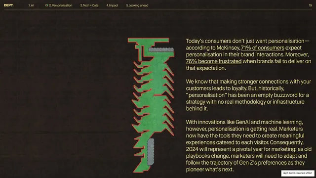
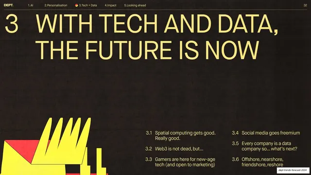
Dark section-divider slide with an oversized yellow all-caps headline numbered 2, a green-and-red torn-paper graphic in the lower left, and a numbered sub-topic list.
Summary
The opening divider for section 2: a near-black slide carrying a giant yellow all-caps headline reading "2 MARKETING GETS PERSONAL, THIS TIME, FOR REAL", with a green-and-red torn-paper collage graphic bleeding off the lower-left corner.
Visual description
Dark brown-black textured ground. The header narrows to the numbered nav with "2.Personalisation" marked by a small green leaf glyph (page 18). A huge yellow grotesque headline in all-caps fills the upper two-thirds, led by a large numeral "2" and broken across three lines with an em-dash. Lower left, a hand-cut collage shape in flat green outlined in bright red, with a grey screw-head element overlaid, bleeds off the edge. Lower right, a numbered sub-topic list in yellow sans-serif: 2.1 Meet conversational commerce, 2.2 Welcome to the conceptual web era, 2.3 Gen Z is more nuanced than you think, 2.4 Searchers no longer give a cl*ck.
Key takeaway
The whole section-divider grammar: oversized all-caps headline plus a leading section number, balanced by a small numbered agenda of what the section covers, with a single rough collage graphic as the only ornament. The green-and-red torn-paper motif gives the dark slides a tactile, anti-corporate edge.
Reuse notes
A strong template for chaptering a long report or trends deck. The dark-yellow contrast and section-number-plus-sublist combo make it instantly readable as a divider. Reuse the same collage-graphic family across all dividers for cohesion; swap the sub-topic list per section.
From this deck: Section 2 divider, Marketing gets personal
View deck