Preview image. Unlock full-res
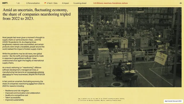
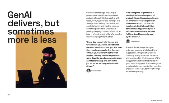
Split content slide with a serif statement and a bulleted body column left, and a large duotone factory-floor photograph filling the right half.
Summary
A content slide with a serif statement and a bulleted body column on the left, and a large duotone (yellow-tinted) factory-floor photograph filling the right half.
Visual description
Pale-yellow field. Top-left is a three-line serif statement headline about nearshoring tripling from 2022 to 2023. Below it, a single column of small sans-serif body copy with underlined inline links, ending in a short bulleted list (Resilience and risk mitigation, Improved communication, Quality at a competitive cost, Talent accessibility, Improved sustainability). The right half is a duotone yellow-toned photograph of a worker seated at a desk on a large automotive-parts factory floor. A two-line monospace caption credits the photo at the lower right. The standard hairline header and page "49" run across the top.
Key takeaway
The recurring serif-statement-plus-body-left, duotone-photo-right layout, here tied together because the photo is tinted into the deck's warm palette so a documentary image still feels on-brand. The closing bullet list gives the reader a scannable takeaway.
Reuse notes
A workhorse content layout for report slides that pair an argument with one supporting photo. Tinting photos to a single hue is what keeps mixed photographic sources visually unified across the deck. The bullet list is a good closer when the body copy runs long.
From this deck: Nearshoring tripled factory photo
View deck