Preview image. Unlock full-res
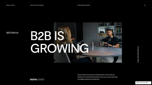
Dark section-divider slide where an oversized white "B2B IS GROWING" headline overlaps a centered podcast photo, labelled Section 07.
Summary
A near-black section-opener for "Section 07" whose oversized two-line white headline "B2B IS GROWING" runs across and partly over a centered photo of a podcast recording.
Visual description
Full near-black field. The standard running header sits along the top in small all-caps: "DIGITAL VOICES" left, "THE STATE OF INFLUENCE" and "2025 INSIGHTS REPORT" across the middle, page number "37" right. "SECTION 07" is set small at left, vertically aligned with the headline. A huge white sans-serif headline, "B2B IS / GROWING", spans two lines and overlaps the left edge of a landscape photo showing two people at a round table in a podcast studio. A rotated "Image: StevenBartlett.com" credit runs up the right edge. A line of muted body copy sits bottom-right ("Social media isn't just about entertainment..."), with the "DIGITAL VOICES" wordmark bottom-left.
Key takeaway
The divider device of letting an oversized headline straddle the edge of a single photo so type and image read as one block, against an otherwise empty dark canvas. The tiny "SECTION 07" tag does all the navigational work without a heavy label.
Reuse notes
A clean section-break pattern for long dark reports and pitch decks. Reusable wherever you want a chapter marker that feels editorial rather than utilitarian. Needs a strong, dark-toned photo so the white headline stays legible where it overlaps.
From this deck: B2B Is Growing section divider
View deck