Preview image. Unlock full-res
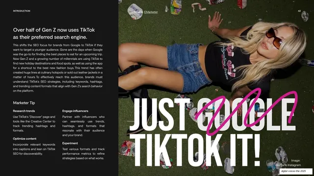
Split slide with a light text-and-tips column on the left and a dark photo panel on the right where a graffiti-style headline crosses out "GOOGLE" to read "JUST TIKTOK IT!".
Summary
A split slide: a light left column of body copy and four "Marketer Tip" items, beside a dark photo panel where a giant white headline reads "JUST GOOGLE TIKTOK IT!" with "GOOGLE" struck through by a hot-pink scribble.
Visual description
The left two-thirds is off-white. A small "INTRODUCTION" tag tops a dark sans headline, "Over half of Gen Z now uses TikTok as their preferred search engine", with a justified paragraph beneath. A "Marketer Tip" block lays out four labelled items in two columns: Research trends, Optimize content, Engage influencers, Experiment, each with a short instruction. The right third is a dark photographic panel (litter on grass, a person lying down, shot top-down). Overlaid in huge white type: "JUST GOOGLE / TIKTOK IT!", where the word "GOOGLE" is crossed out by a looping hot-pink marker scribble. A small "Image: Alix Earle Instagram" credit sits bottom-right; page number "42" top-right.
Key takeaway
The editorial joke: setting "GOOGLE" then striking it through in hand-drawn pink to land "JUST TIKTOK IT", which makes the thesis memorable in one glance. Splitting structured marketer tips (light, ordered) against an expressive image panel (dark, loud) balances substance and personality.
Reuse notes
Good for a punchy insight or "takeaway" slide where you want one quotable line plus practical tips. The strikethrough scribble device works once or twice per deck before it wears out. Keep the tip list to short labelled actions; the dark photo panel needs enough contrast for the white headline and pink mark to pop.
From this deck: Just Google TikTok It marketer-tip spread
View deck





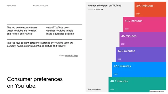

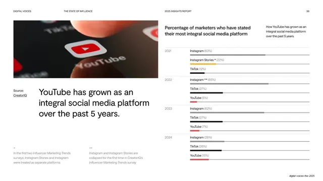
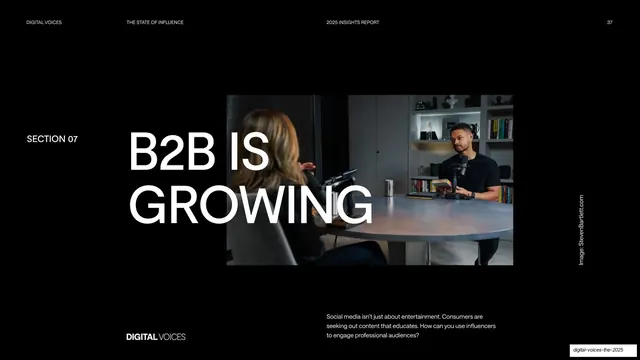
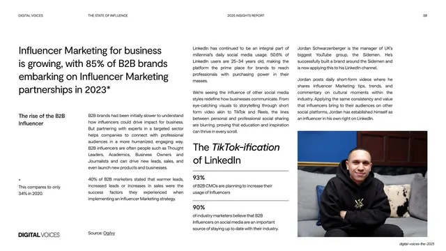

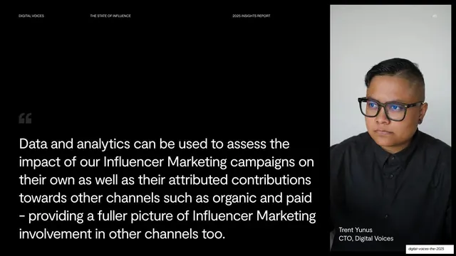
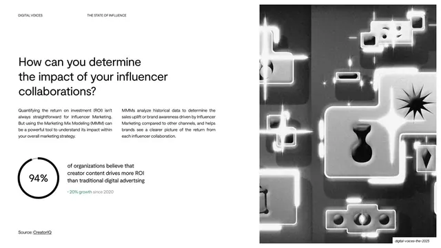
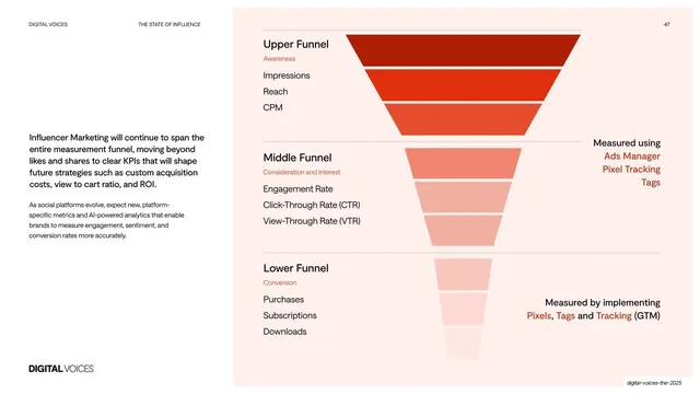
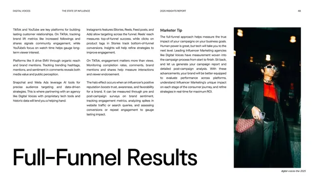
More like this






Keep what you find
A free account saves references to boards and can send you a weekly email of picks based on what you save.
To see every result, go Pro.