Preview image. Unlock full-res
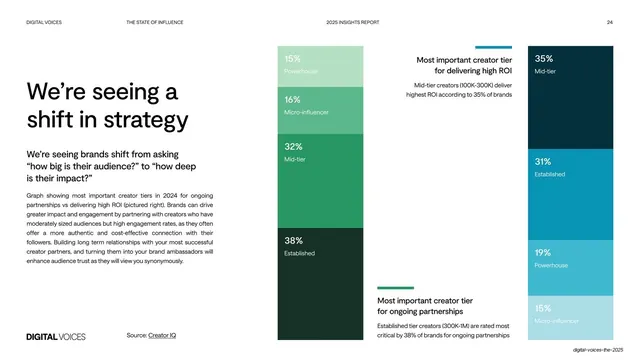
Light data slide pairing an oversized headline and explainer with two full-height stacked bar charts in green and teal comparing creator tiers for partnerships versus ROI.
Summary
A "We're seeing a shift in strategy" slide that sets an oversized headline and explainer paragraph beside two full-height stacked bar charts, one green, one teal, comparing creator tiers for ongoing partnerships versus highest ROI.
Visual description
White slide. Left third: an oversized two-line black headline "We're seeing a / shift in strategy", a bold sub-line about shifting from "how big" to "how deep", a justified explainer paragraph, and a "Source: Creator IQ" credit with the "DIGITAL VOICES" wordmark at the foot. The middle is a single full-height stacked bar in greens (15% Powerhouse, 16% Micro-influencer, 32% Mid-tier, 38% Established), each segment labeled inside in white. The right is a matching teal stacked bar (35% Mid-tier, 31% Established, 19% Powerhouse, 15% Micro-influencer). Two short captions float between the bars, each with a small colored tick, explaining the "most important creator tier" for delivering ROI and for ongoing partnerships.
Key takeaway
Two side-by-side full-bleed stacked bars in two color families turn a "this versus that" comparison into one glance; labeling percentages inside each segment removes the need for an axis. The floating captions with color ticks tie prose to the right bar.
Reuse notes
A clean pattern for comparing the same categories across two metrics (here partnerships vs ROI). The full-height bars read as design, not just chart. Keep each chart to one color family so the comparison stays obvious; works for survey or share-of-mix data.
From this deck: Shift in strategy stacked bar comparison
View deck


















More like this





Keep what you find
A free account saves references to boards and can send you a weekly email of picks based on what you save.
To see every result, go Pro.