Preview image. Unlock full-res
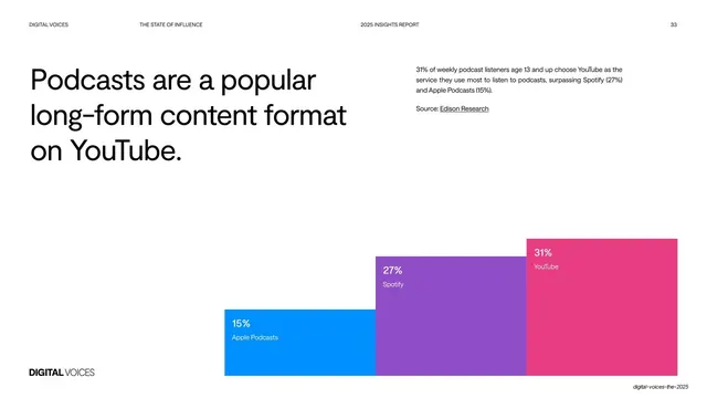
Light data slide with an oversized headline and a short stat caption up top, and three tall stepped color bars comparing podcast platform share along the bottom.
Summary
A "Podcasts are a popular long-form content format on YouTube" slide: an oversized headline and a short stat caption sit in the upper area, with three tall stepped bars in blue, purple, and pink comparing podcast platform share along the bottom.
Visual description
White slide with generous whitespace. An oversized three-line black headline fills the upper-left. A short caption block top-right notes 31% of weekly podcast listeners choose YouTube, with a "Source: Edison Research" credit. The lower portion holds three tall rectangular bars stepping up left to right: a blue "15% Apple Podcasts", a taller purple "27% Spotify", and the tallest pink "31% YouTube", each labeled in white inside the top of the bar. The header bar and "DIGITAL VOICES" wordmark frame the page.
Key takeaway
Oversized stepped bars in three distinct platform colors, labeled inside, turn a three-value comparison into a bold graphic that needs no axis or gridlines. The wide whitespace above lets the headline and bars each breathe.
Reuse notes
Ideal for a simple three- or four-way share comparison where you want the chart to read as design. Color each bar by brand for instant recognition. Best with very few data points; more bars would crowd the clean look.
From this deck: Podcasts on YouTube bar chart
View deck

































More like this






Keep what you find
A free account saves references to boards and can send you a weekly email of picks based on what you save.
To see every result, go Pro.