Preview image. Unlock full-res
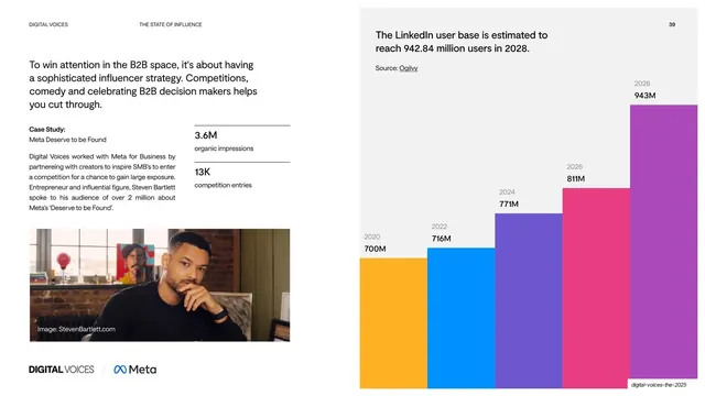
Split slide pairing a Meta "Deserve to be Found" case study and result stats on the left with a tall colourful LinkedIn-growth bar chart on the right.
Summary
A two-part light slide: a Meta "Deserve to be Found" case study with two result stats and a portrait on the left, beside a tall multi-coloured bar chart of projected LinkedIn user growth on the right.
Visual description
White background, standard small all-caps running header with page number "39". The left half opens with a dark sans headline, "To win attention in the B2B space, it's about having a sophisticated influencer strategy...", then a "Case Study: Meta Deserve to be Found" block of body copy. Two result stats sit on hairline rules: "3.6M organic impressions" and "13K competition entries". A photo of a seated person fills the lower-left, captioned "Image: StevenBartlett.com", with a "DIGITAL VOICES / Meta" co-brand lockup beneath. The right half is a light grey panel headed "The LinkedIn user base is estimated to reach 942.84 million users in 2028. Source: Ogilvy", under which six ascending bars in orange, blue, purple, pink and magenta climb from 700M (2020) to 943M (2028), each topped with its year and value.
Key takeaway
Putting a narrative case study and a hard data chart side by side on one slide, so proof-of-work and market context reinforce each other. The rainbow ascending bars read instantly as growth and add colour to an otherwise restrained light layout.
Reuse notes
A reusable "case study plus supporting data" layout for report and pitch decks. The split keeps qualitative and quantitative evidence legible without crowding. Needs a clean result-stat set and a chart whose trend is obvious at a glance; label every bar as here so the projection is unambiguous.
From this deck: Meta case study with growth bar chart
View deck








More like this


Keep what you find
A free account saves references to boards and can send you a weekly email of picks based on what you save.
To see every result, go Pro.