Preview image. Unlock full-res
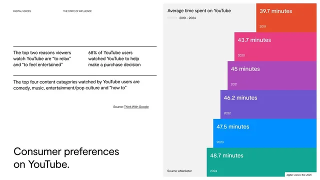
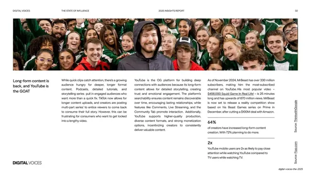
Light slide pairing left-side facts and an oversized bottom headline with a right-side cascading stepped bar chart of average YouTube watch time from 2019 to 2024.
Summary
A "Consumer preferences on YouTube" slide: short facts about why people watch YouTube on the left with an oversized bottom-anchored headline, beside a cascading rainbow stepped bar chart of average watch time growing from 2019 to 2024.
Visual description
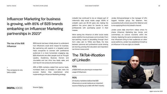
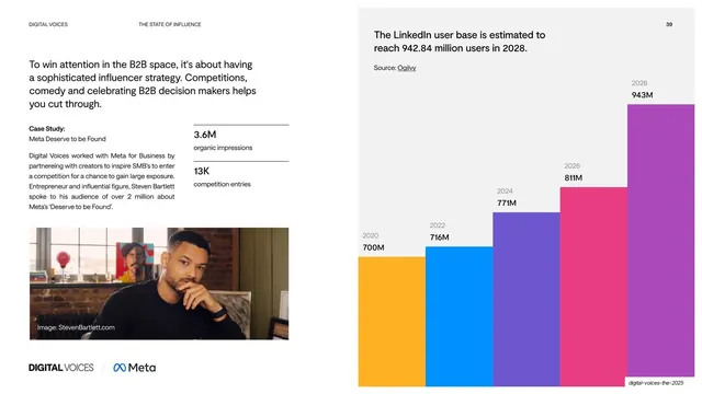
White slide. The left half stacks short fact lines between hairline rules (top two reasons viewers watch; 68% watched to help a purchase decision; top four content categories) with a "Source: Think With Google" credit, and an oversized two-line lowercase headline, "Consumer preferences / on YouTube.", anchored at the bottom-left. The right half is a "Average time spent on YouTube, 2019-2024" chart: six wide horizontal bars cascading down and rightward, each a different color (orange, pink, purple, indigo, blue, teal), labeled with a rising minutes figure (39.7 up to 48.7) and its year, on a pale gray panel. A "Source: eMarketer" credit sits at the foot.
Key takeaway
A cascading staircase of rainbow bars makes steady year-over-year growth feel like momentum, more dynamic than a plain ascending bar chart. Anchoring the oversized headline at the bottom-left balances the busy chart on the right.
Reuse notes
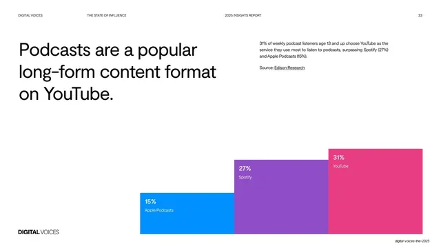
A strong way to show a single metric climbing over time when you want the chart to carry visual energy. The per-year color coding is decorative; keep labels inside the bars. Pairs naturally with the simpler stepped-bar slide 33 in the same section.
From this deck: Consumer preferences on YouTube stepped bars
View deck














More like this





Keep what you find
A free account saves references to boards and can send you a weekly email of picks based on what you save.
To see every result, go Pro.