Preview image. Unlock full-res
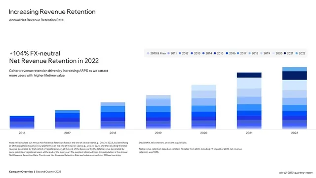
White slide with multi-band blue stacked bars showing net revenue retention by cohort year, a left-set oversized "+104%" callout, and a color-coded legend.
Summary
A net-revenue-retention chart: seven bars (2016 to 2022), each stacked into many blue cohort bands that grow taller over time, with an oversized "+104% FX-neutral Net Revenue Retention in 2022" callout set on the left.
Visual description
White background. "Increasing Revenue Retention" headline top-left, "Annual Net Revenue Retention Rate" subtitle. On the left, an oversized two-line statement "+104% FX-neutral Net Revenue Retention in 2022" with a small grey supporting line beneath. The right two-thirds plots seven vertical bars, each divided into many thin horizontal bands in graduated blues (darkest navy at top) keyed to a long year legend pill (2010 & Prior through 2022) above the plot; the bars rise steadily from 2016 to 2022. A two-column methodology footnote runs below; bold footer bottom-left.
Key takeaway
Showing retention as stratified blue bands that visibly accumulate year over year, anchored by one oversized headline percentage on the left, so the layered bars and the big number tell the same "revenue compounds" story together.
Reuse notes
For net revenue retention or any layered-cohort buildup. The graduated single-hue band scale plus a long legend keeps many layers readable. Lead with the headline retention figure at large size on the left, as here, so the takeaway lands before the bars are parsed.
From this deck: Increasing Revenue Retention stacked bar chart
View deck



More like this





Keep what you find
A free account saves references to boards and can send you a weekly email of picks based on what you save.
To see every result, go Pro.