Preview image. Unlock full-res
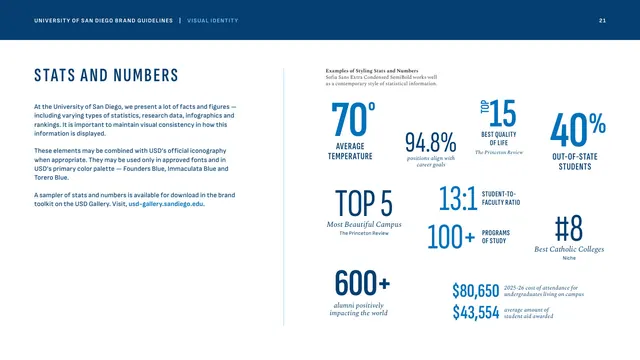
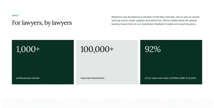
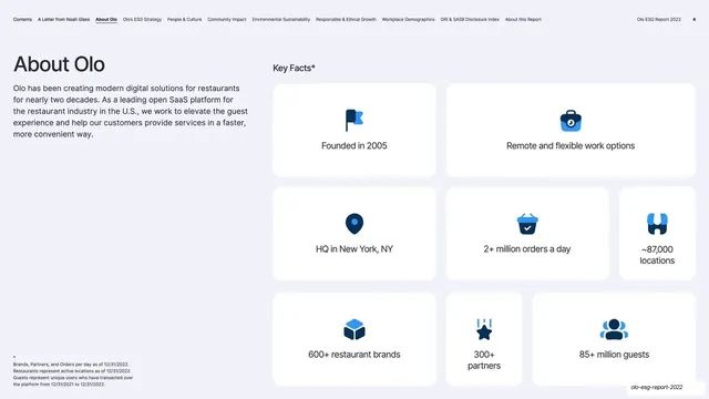
A scattered field of statistics styled in condensed sans and Spectral italic, showing how to present rankings and figures consistently in brand blues.
Summary
The stats-and-numbers page, demonstrating a house style for statistics and rankings using oversized condensed numerals paired with Spectral italic labels, all in the primary blues.
Visual description
Left column: "STATS AND NUMBERS" in tracked condensed Founders Blue caps, with body copy on presenting varied figures consistently using only approved fonts and the primary palette, plus a bright-blue toolkit link. The right two-thirds is an airy, asymmetric scatter of statistic blocks at varying sizes: "70 degrees AVERAGE TEMPERATURE," "94.8% positions align with career goals," "TOP 15 BEST QUALITY OF LIFE," "40% OUT-OF-STATE STUDENTS," "TOP 5 Most Beautiful Campus," "13:1 STUDENT-TO-FACULTY RATIO," "100+ PROGRAMS OF STUDY," "#8 Best Catholic Colleges," "600+ alumni positively impacting the world," and tuition figures. Big numbers are condensed sans in two blues; qualifiers and sources are small Spectral italic.
Key takeaway
A consistent stat treatment, large condensed numeral, small caps or italic label, optional italic source line, lets a brand drop figures anywhere and have them feel unified. Mixing Immaculata and Founders Blue across the numbers adds rhythm without breaking the palette. The loose asymmetric scatter keeps a data-heavy page from feeling like a table.
Reuse notes
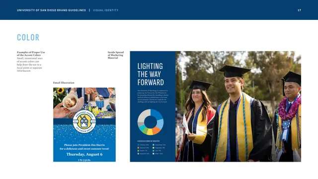
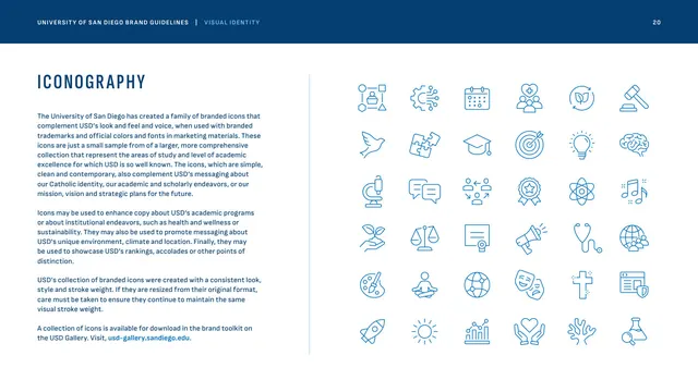
A strong template for any organization that leans on rankings and metrics in marketing (universities, nonprofits, B2B). The number-plus-italic-label pattern is directly reusable. Pairs with the iconography page and the accent-usage donut-chart example.
From this deck: Stats and numbers styling
View deck



More like this



Keep what you find
A free account saves references to boards and can send you a weekly email of picks based on what you save.
To see every result, go Pro.