Preview image. Unlock full-res
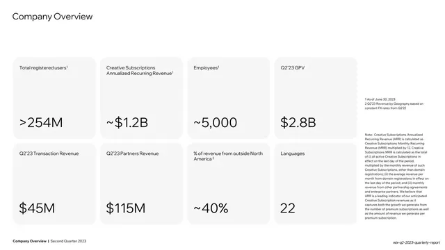
White slide with eight rounded KPI cards in a 4x2 grid, each holding an oversized headline metric over a label, with dense footnotes at right.
Summary
A key-metrics overview: eight rounded grey cards in a four-by-two grid, each pairing a small label with an oversized number, plus a column of dense footnotes on the right edge.
Visual description
White background. "Company Overview" sits top-left as a thin charcoal headline. Below, a four-column, two-row grid of soft grey rounded cards. Each card has a small label top-left (Total registered users, Creative Subscriptions ARR, Employees, Q2'23 GPV, Q2'23 Transaction Revenue, Q2'23 Partners Revenue, % of revenue from outside North America, Languages) and a large dark figure anchored lower-left (">254M", "~$1.2B", "~5,000", "$2.8B", "$45M", "$115M", "~40%", "22"). A narrow right-hand column holds small grey footnote and methodology text. The bold footer reads "Company Overview | Second Quarter 2023".
Key takeaway
The 4x2 KPI card grid as a single high-density "state of the business" slide: uniform rounded cards, tiny labels, oversized numbers, all the supporting definitions exiled to a quiet footnote column so the headline figures stay clean.
Reuse notes
Ideal for the at-a-glance metrics slide of any earnings, board, or company-overview deck. The fixed card template scales to fewer or more metrics by changing grid columns. Keep the methodology text small and to the side so it never competes with the numbers.
From this deck: Company Overview KPI card grid
View deck






More like this



Keep what you find
A free account saves references to boards and can send you a weekly email of picks based on what you save.
To see every result, go Pro.