Preview image. Unlock full-res
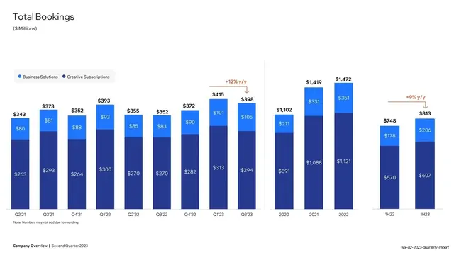
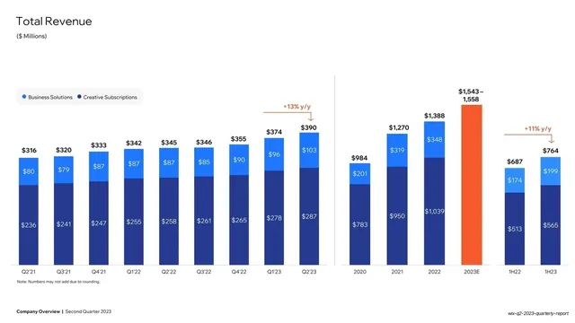
White slide charting total bookings as two-tone blue stacked bars across quarterly, annual, and half-year timeframes with orange y/y growth callouts.
Summary
A total-bookings chart: two-tone blue stacked bars (Business Solutions over Creative Subscriptions) shown across three timeframes (quarterly, annual, half-year), each block carrying its own orange y/y growth callout.
Visual description
White background. "Total Bookings" headline top-left, "($ Millions)" subtitle. The same two-segment blue stacked-bar language as the revenue slide, with a navy lower segment and bright-blue upper segment, every segment and total labelled. The plot is divided by thin vertical rules into three groups: a quarterly run (Q2'21 to Q2'23), an annual run (2020 to 2022), and a half-year pair (1H22 vs 1H23). Each group has its own orange y/y arrow callout ("+12% y/y", "+9% y/y"). A small legend sits above; bold footer below.
Key takeaway
Packing three timeframes (quarter, year, half-year) into one chart by separating them with hairline vertical rules and giving each its own growth callout, so a single slide answers "how are bookings trending" at every cadence without three separate charts.
Reuse notes
Reuse for any metric you want to show at multiple cadences at once. The shared blue stacked-bar system and orange-delta convention keep it consistent with the revenue slide. Works best when each timeframe group has its own clearly labelled growth figure.
From this deck: Total Bookings stacked bar chart
View deck



More like this





Keep what you find
A free account saves references to boards and can send you a weekly email of picks based on what you save.
To see every result, go Pro.