Preview image. Unlock full-res
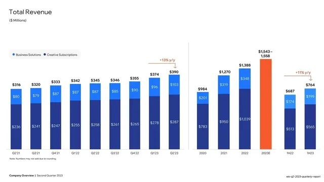
White slide charting quarterly and annual total revenue as two-tone blue stacked bars, split into segments, with orange y/y growth callouts.
Summary
A total-revenue chart: two-tone blue vertical stacked bars (Business Solutions over Creative Subscriptions) running quarterly from Q2'21 to Q2'23 and annually 2020 to 2023E, with orange y/y growth arrows and a highlighted orange forecast bar.
Visual description
White background. "Total Revenue" headline top-left with "($ Millions)" subtitle. A small legend (Business Solutions in bright blue, Creative Subscriptions in navy) sits above the plot. Each bar splits into a navy lower segment and a bright-blue upper segment, both labelled with dollar values, and totals sit above each bar. The series runs left to right by quarter, then a thin vertical divider separates an annual series; the 2023E bar is rendered solid orange to mark the estimate. Orange "+13% y/y" and "+11% y/y" callouts with arrows highlight growth. Bold footer bottom-left.
Key takeaway
The two-blue stacked-bar system: navy plus bright blue for two revenue segments, every segment and total labelled, with orange reserved only for the growth-delta callout and the single forecast bar so the eye lands on the story immediately.
Reuse notes
A clean default for any segmented revenue or bookings trend over time. The quarterly-then-annual layout with a divider packs two timeframes into one slide. Reusing the same blue palette and orange-for-deltas rule across every chart slide makes the whole financial section read as one system.
From this deck: Total Revenue stacked bar chart
View deck






More like this






Keep what you find
A free account saves references to boards and can send you a weekly email of picks based on what you save.
To see every result, go Pro.