Preview image. Unlock full-res
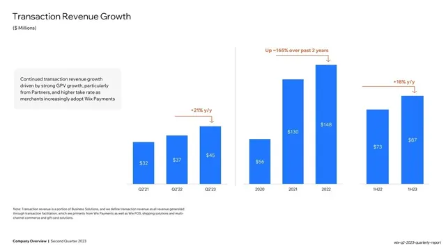
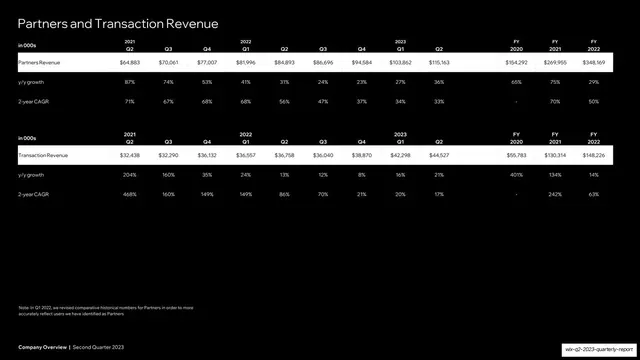
White slide charting transaction revenue as bright-blue bars across three timeframes, with a grey commentary card and orange growth callouts.
Summary
A transaction-revenue chart mirroring the partners slide: bright-blue bars across Q2 snapshots, annual, and half-year groups, with a grey commentary card on the left and orange growth callouts including "Up ~165% over past 2 years".
Visual description
White background. "Transaction Revenue Growth" headline top-left, "($ Millions)" subtitle. A grey rounded commentary card on the left holds a paragraph crediting GPV growth and Wix Payments adoption. To its right, bright-blue single-series bars labelled with dollar values run in three groups (Q2'21/Q2'22/Q2'23, 2020-2022, 1H22/1H23) divided by a thin vertical rule. Orange callouts ("+21% y/y", "Up ~165% over past 2 years", "+18% y/y") sit above the bars. Methodology footnote below; bold footer bottom-left.
Key takeaway
Repeating the exact partners-slide layout (commentary card left, three-group blue bars right, orange deltas above) so consecutive metric slides feel like one consistent template rather than separately designed charts.
Reuse notes
A direct sibling to the partners slide; reuse the same template for each driver metric in a section so the reader learns the layout once. The grey commentary card is the reusable element for adding a line of context to each chart.
From this deck: Transaction Revenue Growth bar chart
View deck



More like this





Keep what you find
A free account saves references to boards and can send you a weekly email of picks based on what you save.
To see every result, go Pro.