Preview image. Unlock full-res
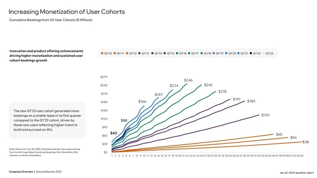
White slide with a dense multi-line cohort chart in a warm-to-cool color scale, paired with two text blocks and a long color-coded legend.
Summary
A cohort-monetization chart: roughly a dozen cumulative-bookings curves, one per annual cohort from Q1'10 to Q1'23, color-coded along a warm-to-cool scale, with a headline note and a grey commentary card on the left.
Visual description
White background. "Increasing Monetization of User Cohorts" headline top-left, "Cumulative Bookings from Q1 User Cohorts ($ Millions)" subtitle. A bold black note ("Innovation and product offering enhancements driving higher monetization...") sits at upper-left; a grey rounded commentary card with a paragraph about the Q1'23 cohort sits at lower-left. The right two-thirds is a multi-line area: many cohort curves fan out across a quarter-numbered x-axis (1-54) and a dollar y-axis, each line a different hue (oranges, purples, greens, blues) keyed to a long horizontal pill legend of years above the plot, with end-of-line value labels. Bold footer bottom-left.
Key takeaway
Encoding many cohorts as a fan of color-coded lines with a single long legend pill, then using two text blocks (a bold takeaway and a grey detail card) on the left so a genuinely dense chart still leads with a one-line conclusion.
Reuse notes
For cohort, retention, or any many-series trend where the shape of the fan is the message. Demands a careful, ordered color scale and a compact legend to stay legible. The bold-takeaway-plus-grey-card pairing on the left is a good way to caption a complex chart.
From this deck: Increasing Monetization of User Cohorts line chart
View deck






More like this






Keep what you find
A free account saves references to boards and can send you a weekly email of picks based on what you save.
To see every result, go Pro.