Preview image. Unlock full-res
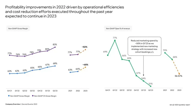
White slide with two side-by-side line charts, one rising (gross margin) and one falling (opex as percent of revenue), each with dashed orange forecast extensions.
Summary
A two-panel margin slide: a left chart with two rising gross-margin lines (blue and purple) and a right chart with a single falling opex-percent line (green), each extended into 2023 by a dashed orange forecast segment.
Visual description
White background. A three-line headline ("Profitability improvements in 2022 driven by operational efficiencies and cost reduction efforts...") top-left. Two charts sit side by side. Left, under a "Non-GAAP Gross Margin" pill, a blue line and a purple line both climb quarter by quarter, each value-labelled, then continue as dashed orange segments to forecast points ("~68%", "~82%"). Right, under a "Non-GAAP Opex % of revenue" pill, a single green line falls from 69% to 51%, with a dotted annotation box about reduced marketing spend, then a dashed orange forecast down to "56-57%". Two-item legend bottom-left; bold footer.
Key takeaway
Pairing two small line charts so opposing trends (margin up, opex down) read as one coordinated improvement, and using a dashed orange extension off the end of each line to mark forecast cleanly without a separate series or chart.
Reuse notes
For showing complementary ratios side by side, or actuals-then-forecast on a line. The dashed-orange forecast tail is the reusable device; it keeps projection visually distinct from history. A dotted annotation box is a tidy way to explain an inflection on the line.
From this deck: Profitability improvements dual line charts
View deck






More like this





Keep what you find
A free account saves references to boards and can send you a weekly email of picks based on what you save.
To see every result, go Pro.