Preview image. Unlock full-res
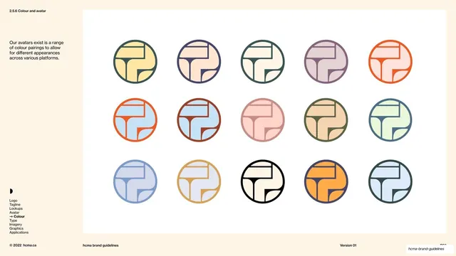
A 5x3 grid of the circular HCMA avatar shown in fifteen two-tone colour pairings for use across different platforms.
Summary
A swatch wall of the circular HCMA avatar repeated fifteen times in different two-tone colour pairings, giving teams a ready set of platform-appropriate profile marks.
Visual description
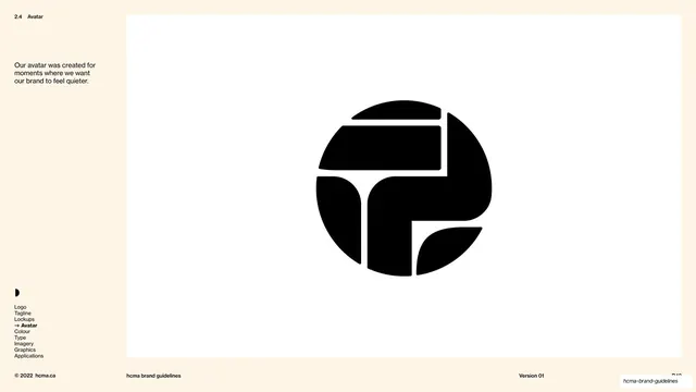
Warm cream page with the same thin left rail as the surrounding spreads: section number "2.5.6 Colour and avatar", a two-line note, the half-circle glyph, and the contents list with "Colour" highlighted. The main white panel holds a five-column, three-row grid of the avatar, a roundel built from an outlined circle containing the abstracted HCMA line-mark. Each instance pairs a coloured fill with a contrasting outline and mark: warm yellows, dusty pinks, mauve, orange, teal, sage, cornflower and a black-on-cream version, so the same mark reads softly or boldly depending on the duo. Spacing is generous and even, so the colour relationships are the only subject. The standard footer runs along the bottom with copyright, deck title, version and page number.
Key takeaway
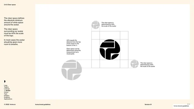
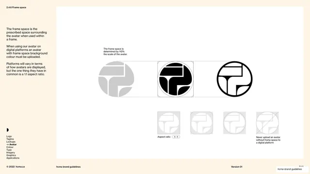
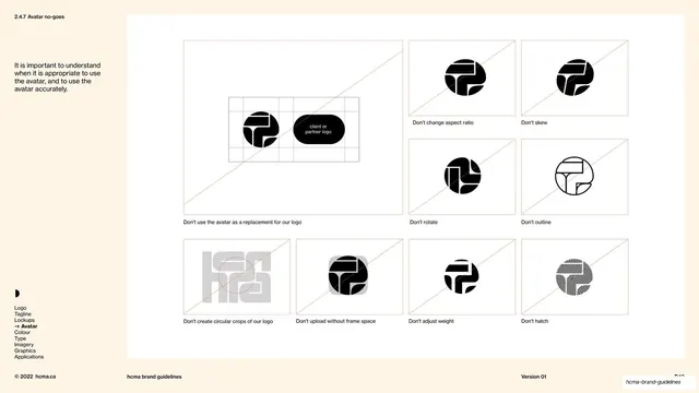
Treating the avatar as a colour system rather than one fixed lockup: a single circular mark multiplied into a palette-driven grid gives every platform a different yet on-brand profile image. The consistent outline-plus-fill structure keeps fifteen variants feeling like one family.
Reuse notes
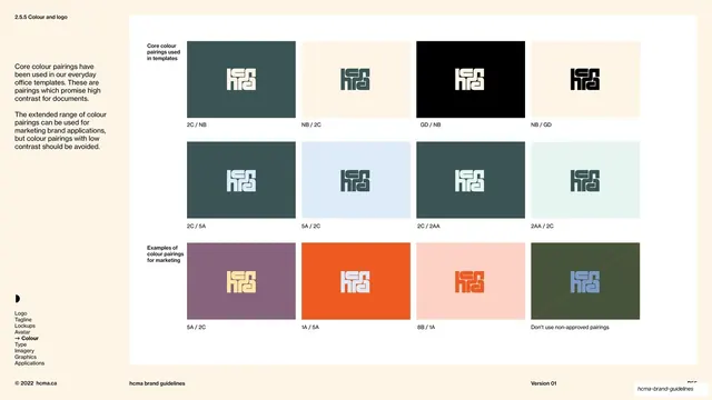
Ideal for the avatar or app-icon page of an identity built for many social and product surfaces. Depends on a mark simple enough to stay legible at small circular sizes. Pair with a documented palette so each pairing maps to named swatches.
From this deck: HCMA colour and avatar pairings grid
View deck



More like this
Keep what you find
A free account saves references to boards and can send you a weekly email of picks based on what you save.
To see every result, go Pro.