MITA Brand Book
A 38-page brand book for Malta's government IT agency built on a crimson-and-navy palette, a chevron "greater-than" symbol, and a geometric sans-serif type system.
38 slides · Guideline
View deck overview
MITA Brand Book cover

Chevron line-pattern spread (navy)

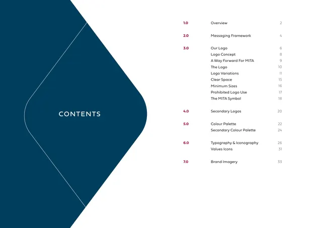
Contents page

Section divider 1.0 Overview

The Brand (overview copy)

Section divider 2.0 Messaging Framework

The Messaging Framework copy

Section divider 3.0 Our Logo

Logo Concept

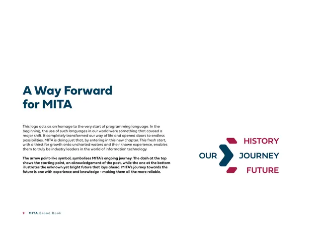
A Way Forward for MITA (symbol rationale)

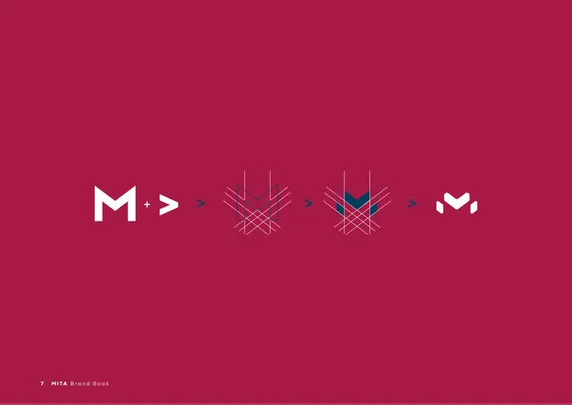
Logo construction (M plus arrow)

The Logo (primary lockup)

Logo Variations (primary on light)

Logo Variations (white on crimson)

Logo Variations (grayscale on light)

Logo Variations (grayscale on black)

Clear Space

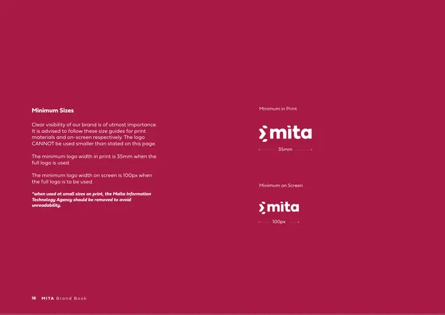
Minimum Sizes

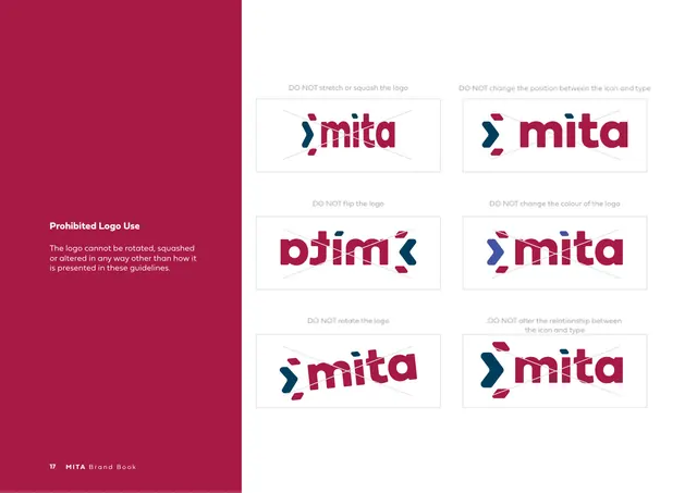
Prohibited Logo Use

Sub-divider The MITA Symbol

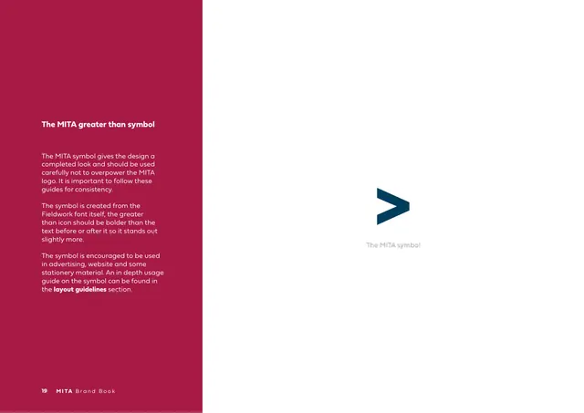
The MITA greater-than symbol

Section divider 4.0 Secondary Logos

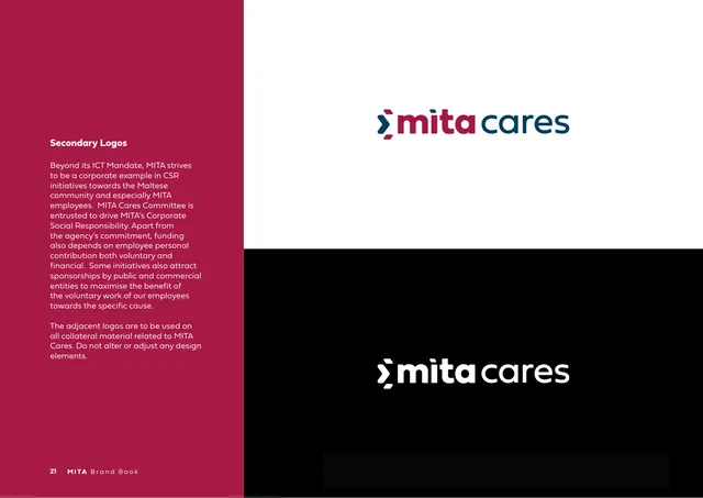
Secondary Logos (mita cares)

Section divider 5.0 Colour Palette

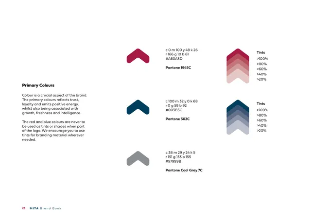
Primary Colours

Sub-divider Secondary Colour Palette

Secondary Colours

Section divider 6.0 Typography & Iconography

Fieldwork Geo alphabet specimen (brand colours)

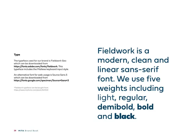
Type (Fieldwork Geo)

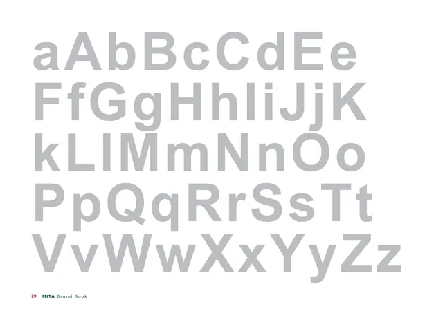
Arial alphabet specimen (grayscale)

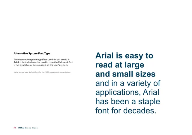
Alternative System Font Type (Arial)

Sub-divider Values Icons

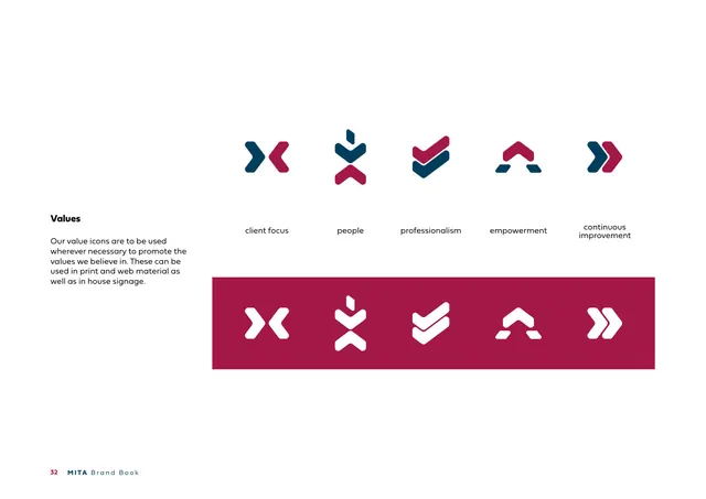
Values (icon set)

Section divider 7.0 Brand Imagery

Imagery (photography direction)

Chevron line-pattern spread (navy, closing)

Back cover