Preview image. Unlock full-res
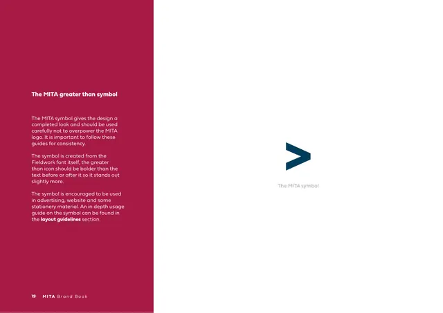
Symbol-usage page on crimson explaining the standalone ">" mark, with the navy chevron shown large at right.
Summary
The "MITA greater than symbol" page: copy on the standalone chevron mark, derived from the Fieldwork font's greater-than glyph, with the navy symbol shown large at right.
Visual description
The left half is a crimson (#A60A3D) panel holding a white bold heading "The MITA greater than symbol" and several light paragraphs: the symbol completes the design and should not overpower the logo, it is built from the Fieldwork font's greater-than character and should be slightly bolder than surrounding text, and it is encouraged in advertising, web and stationery. The right half is white with a single large navy ">" arrowhead and a small gray caption "The MITA symbol". Footer: "19 MITA Brand Book".
Key takeaway
Promoting one glyph of the logo (the ">") to a reusable standalone brand device, and saying explicitly where it may be used, extends the identity beyond the full lockup. Noting it derives from the type system ties symbol and typeface together.
Reuse notes
Use when a brand has a graphic element that can live on its own as a supporting device. The crimson-panel-left, mark-right split echoes other rationale pages. Caveat from the copy: keep the symbol secondary so it never competes with the full logo.
From this deck: The MITA greater-than symbol
View deck









More like this





Keep what you find
A free account saves references to boards and can send you a weekly email of picks based on what you save.
To see every result, go Pro.