Preview image. Unlock full-res
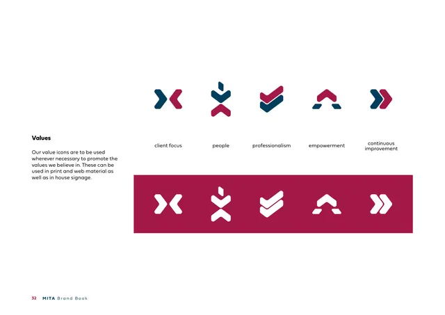
Five chevron-derived value icons (client focus, people, professionalism, empowerment, continuous improvement) shown in colour and reversed on a crimson band.
Summary
The "Values" page: five icons built from the brand chevron, labeled client focus, people, professionalism, empowerment and continuous improvement, shown in two-colour on white and reversed white on a crimson band.
Visual description
A white page. Left column: a bold heading "Values" and copy stating the value icons can be used in print, web and in-house signage. A horizontal row of five icons, each constructed from navy and crimson arrowhead/chevron parts, sits above its label: client focus (two facing arrows), people (stacked arrows around a point), professionalism (a checkmark-like double chevron), empowerment (an upward A-shape of arrows), continuous improvement (a double forward chevron). Below, a crimson band repeats the same five icons reversed in white. Footer: "32 MITA Brand Book".
Key takeaway
Deriving an entire icon family from one brand shape (the chevron/arrow) makes the set instantly cohesive and unmistakably on-brand. Showing each icon positive on white and reversed on the brand colour documents both use cases in a single row.
Reuse notes
A strong model for a values or feature icon set tied to a logo's geometry: build every icon from the same primitive, label clearly, and show light and reversed. Reuse when a brand has a simple shape that can be recombined. Note the icons are abstract, so labels are essential for meaning.
From this deck: Values (icon set)
View deck







More like this




Keep what you find
A free account saves references to boards and can send you a weekly email of picks based on what you save.
To see every result, go Pro.