Preview image. Unlock full-res
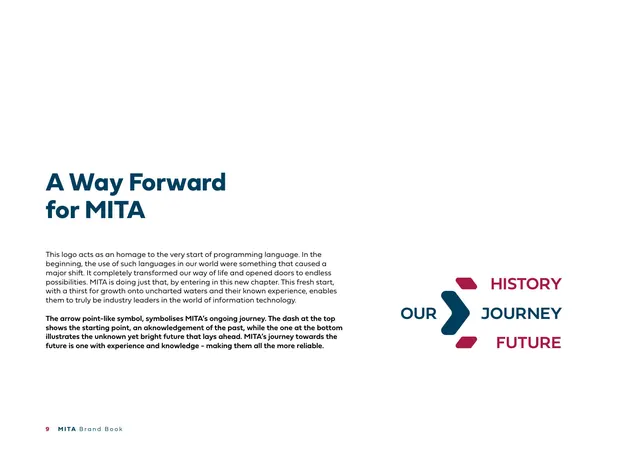
Logo-rationale page with a navy headline and a diagram mapping the chevron's parts to OUR HISTORY, JOURNEY, and FUTURE.
Summary
The "A Way Forward for MITA" page: copy framing the logo as an homage to early programming languages, paired with a diagram that labels the chevron's three parts as OUR, HISTORY, JOURNEY, FUTURE.
Visual description
A white page. Left side: a large navy two-line headline "A Way Forward for MITA", followed by light body copy and a bold paragraph explaining the arrow point as MITA's ongoing journey, the top dash as the starting point/past, and the bottom dash as the bright future ahead. Right side: a navy-and-crimson chevron diagram built from a navy arrowhead flanked by two small crimson dashes; the words "OUR" (navy) sit left of the arrow, with "HISTORY", "JOURNEY", "FUTURE" stacked at right, JOURNEY in navy and HISTORY/FUTURE in crimson, aligning to the three arrow parts.
Key takeaway
Annotating the mark's own components with single words (history / journey / future) turns symbol meaning into a quick visual diagram instead of a paragraph. Splitting the diagram colours to match the copy reinforces which part means what.
Reuse notes
Use when a logo's geometry carries narrative meaning worth diagramming. The headline-left, labeled-mark-right split is reusable for any "what the symbol means" page. Keep the label colours tied to the artwork colours.
From this deck: A Way Forward for MITA (symbol rationale)
View deck





More like this







Keep what you find
A free account saves references to boards and can send you a weekly email of picks based on what you save.
To see every result, go Pro.