Preview image. Unlock full-res
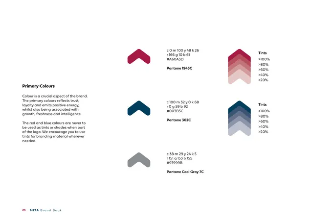
Primary-palette page listing crimson, navy and cool gray as chevron swatches with full CMYK/RGB/HEX/Pantone values and tint ramps.
Summary
The "Primary Colours" page: three brand colours, crimson, navy and cool gray, each shown as a chevron swatch with full CMYK, RGB, HEX and Pantone specs, plus tint ramps for the two leads.
Visual description
A white page. Left column: a bold heading "Primary Colours" and copy noting the colours reflect trust, loyalty and energy, and that the red and blue must never be used as tints or shades when part of the logo though tints are encouraged elsewhere. Three rows each pair a rounded chevron swatch with its values: crimson (C0 M100 Y48 K26 / R166 G10 B61 / #A60A3D / Pantone 1945C), navy (C100 M32 Y0 K68 / R0 G59 B92 / #003B5C / Pantone 302C), and cool gray (C38 M29 Y24 K5 / R151 G153 B155 / #97999B / Pantone Cool Gray 7C). At far right, stacked chevron tint ramps for the crimson and navy run from 100% down to 20%, labeled "Tints". Footer: "23 MITA Brand Book".
Key takeaway
Drawing every colour swatch as the brand's own chevron shape rather than a plain rectangle makes the palette page itself feel branded. Providing all four colour spaces plus a tint ladder per colour is thorough and production-ready.
Reuse notes
A complete primary-palette reference: shape-as-swatch, full multi-space specs, and tint ramps in one view. Reuse the chevron-swatch idea whenever the brand has a signature shape. Note the explicit rule that logo colours cannot be tinted, which keeps the mark consistent.
From this deck: Primary Colours
View deck














More like this







Keep what you find
A free account saves references to boards and can send you a weekly email of picks based on what you save.
To see every result, go Pro.