Preview image. Unlock full-res
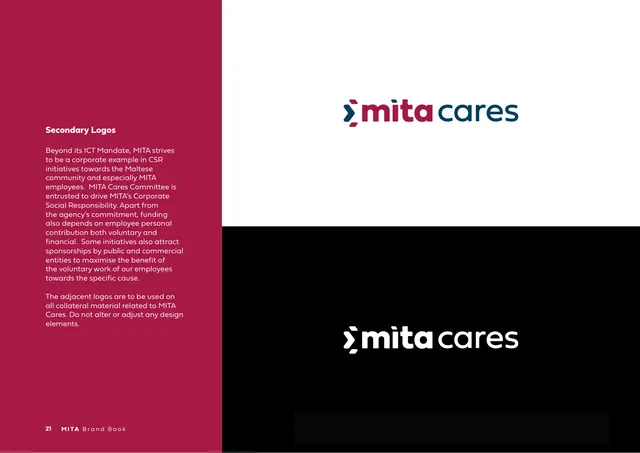
Secondary-logo page introducing the "mita cares" CSR lockup, shown in colour on white and reversed white on black.
Summary
The "Secondary Logos" page: copy on MITA Cares (its CSR effort) alongside the "mita cares" lockup shown in colour on a white half and reversed white on a black half.
Visual description
A crimson left sidebar holds a white bold heading "Secondary Logos" and body copy explaining MITA's corporate social responsibility work and the MITA Cares committee, instructing that the adjacent logos be used on all MITA Cares collateral without alteration. The right area is split horizontally: the top half is white with the lockup "mita cares" (chevron and "mita" in brand colours, "cares" in navy); the bottom half is black with the same lockup all in white. Footer: "21 MITA Brand Book".
Key takeaway
Extending the master logo into a sub-brand by appending a word ("cares") in the secondary colour keeps the family coherent. Showing the sub-brand immediately in both positive and reversed forms on one page sets its usage in a glance.
Reuse notes
Use as a template for documenting a sub-brand or programme lockup: rationale in a sidebar, the lockup shown light and dark side by side. The append-a-word approach works when the parent wordmark is a clean lowercase base. Suits CSR, initiative, or product sub-brands.
From this deck: Secondary Logos (mita cares)
View deck








More like this




Keep what you find
A free account saves references to boards and can send you a weekly email of picks based on what you save.
To see every result, go Pro.