Preview image. Unlock full-res
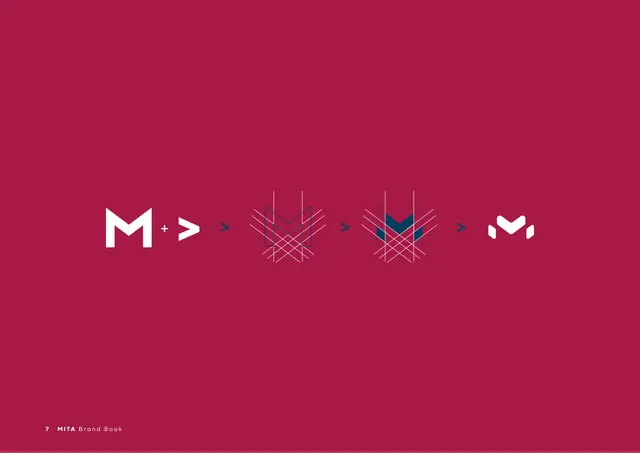
A crimson page showing the symbol built in stages from an "M" and a ">" arrow through a geometric grid into the final mark.
Summary
A construction page that derives the MITA symbol step by step: a white "M" plus a ">" arrow, run through an overlapping geometric grid, resolving into the final navy-and-white chevron mark.
Visual description
A full crimson (#A60A3D) page with a horizontal sequence of construction steps separated by small navy ">" arrows. Left to right: a bold white "M" with a "+" and a white ">"; then the forms merged into a navy line grid of crossing diagonals shaped like an arrowhead; then the same grid with the central chevron filled navy; finally the resolved white-and-navy chevron symbol. The progression reads as a build-up from letterform to finished mark.
Key takeaway
Showing the mark as a left-to-right derivation (source letters, geometric scaffold, filled form, final) makes the logo feel engineered and intentional. Using the brand's own ">" arrows as the connectors between steps is a neat self-referential touch.
Reuse notes
A strong reference for a logo-construction or "how the mark was made" page, especially for geometric marks built from letters plus a symbol. The connector-arrow device only works when the brand has a usable arrow glyph. Reads best on a saturated brand-colour ground.
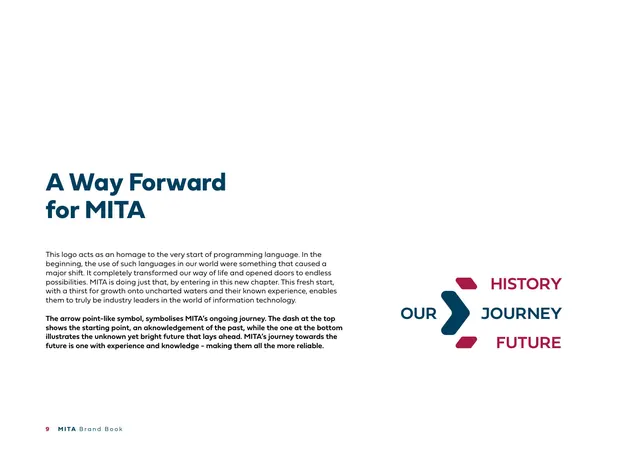
From this deck: Logo construction (M plus arrow)
View deck








More like this






Keep what you find
A free account saves references to boards and can send you a weekly email of picks based on what you save.
To see every result, go Pro.