
Preview image. Unlock full-res
Full-bleed alphabet specimen of the Fieldwork Geo typeface, each letter alternating between crimson and navy.
Summary
A full-page Fieldwork Geo alphabet specimen, the complete upper- and lowercase set laid edge to edge with letters alternating crimson and navy.
Visual description
A white page nearly filled with large letterforms running aAbBcCdEe... through ...XxYyZz across four lines. Each glyph alternates between crimson (#A60A3D) and navy (#003B5C), creating a checker rhythm. The geometric sans-serif (Fieldwork Geo) shows its rounded, even, low-contrast strokes at display size. Footer: "27 MITA Brand Book".
Key takeaway
Setting the full alphabet at huge scale, alternating the two brand colours per letter, makes a type page that doubles as a colour-and-personality statement, not just a character chart. It shows the typeface and the palette at once.
Reuse notes
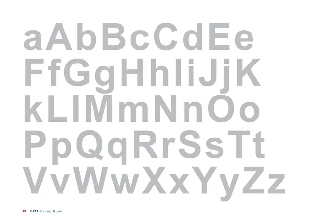
A bold way to present a brand typeface: oversized, paired upper/lowercase, colour-alternated. Use when the typeface is geometric enough to carry display scale. Pairs with the grayscale specimen and the weight/usage page that follow.
From this deck: Fieldwork Geo alphabet specimen (brand colours)
View deck









More like this






Keep what you find
A free account saves references to boards and can send you a weekly email of picks based on what you save.
To see every result, go Pro.