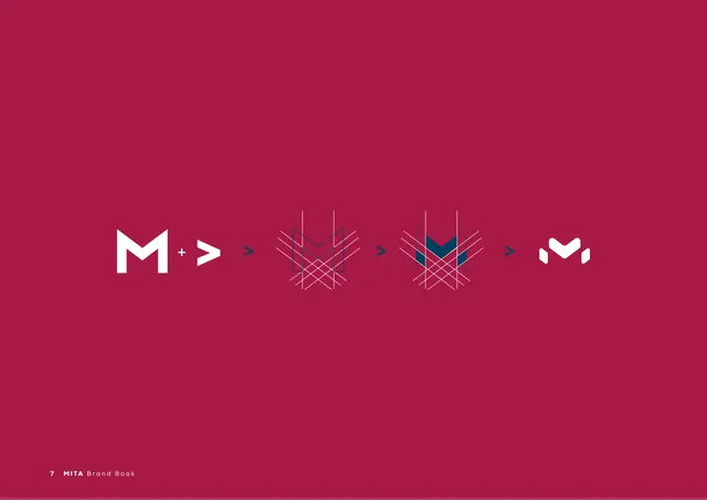
Preview image. Unlock full-res
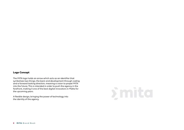
Logo-concept page explaining the arrow symbol, with a faint pale-gray "mita" logo set large at lower right.
Summary
The "Logo Concept" page: copy explaining that the logo's arrow stands for back-end coding and a forward-looking vision, with a large pale-gray "mita" logo ghosted at lower right.
Visual description
A white page. Lower-left holds a bold heading "Logo Concept" and two short paragraphs of dark gray copy: the arrow symbolises back-end development through coding and a forward direction, and the design is described as flexible, bringing the power of technology into the identity. At lower right, the full "mita" logo (chevron plus wordmark) appears oversized in very pale gray, watermark-style. Footer: "8 MITA Brand Book".
Key takeaway
Stating the symbol's meaning in plain language (coding arrow plus forward vision) while showing the mark itself faint and large nearby links rationale to artwork on one page. The ghosted logo doubles as page decoration.
Reuse notes
A clean model for a logo-rationale page: short concept copy on one side, an enlarged faded version of the mark on the other. Use early in a logo chapter to set up the construction pages that follow.
From this deck: Logo Concept
View deck








More like this






Keep what you find
A free account saves references to boards and can send you a weekly email of picks based on what you save.
To see every result, go Pro.