Preview image. Unlock full-res
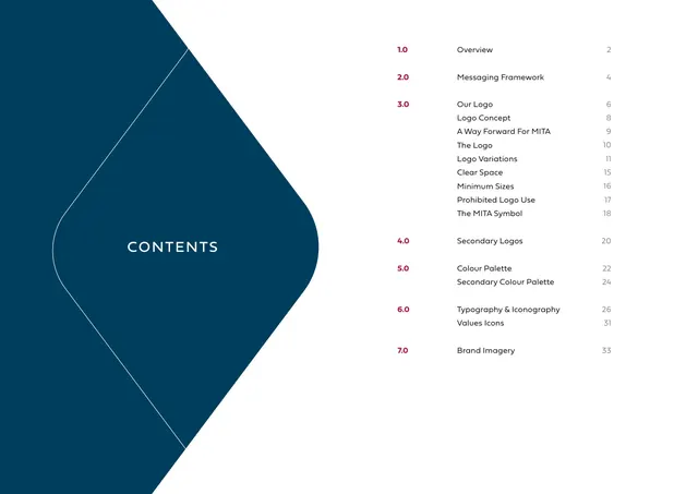
Table of contents with numbered sections at right and a large navy chevron-shaped panel holding the word CONTENTS at left.
Summary
The contents page: a tall navy chevron-cornered panel at left carries "CONTENTS" in white caps, while a clean numbered list of the seven sections runs down the right.
Visual description
Left half is a large dark-navy (#003B5C) shape with a thin white outline and one rounded chevron point, holding the word "CONTENTS" centered in spaced white capitals. The right half is white and lists the document structure: crimson section numbers (1.0 to 7.0), black section titles, and right-aligned gray page numbers. Section 3.0 ("Our Logo") expands into nine indented sub-entries (Logo Concept, A Way Forward For MITA, The Logo, Logo Variations, Clear Space, Minimum Sizes, Prohibited Logo Use, The MITA Symbol). Generous line spacing separates the seven groups.
Key takeaway
Hosting the page title inside a brand-shaped panel rather than plain type makes a utilitarian contents page on-brand. Crimson numbers, black titles, gray page numbers is a clear three-tier hierarchy for any index.
Reuse notes
A solid layout for the contents of any long guideline or report: brand shape on one side, structured list on the other. The colour-coded number/title/page-number split scales to many entries. Pairs naturally with the numbered divider pages that follow.
From this deck: Contents page
View deck












More like this





Keep what you find
A free account saves references to boards and can send you a weekly email of picks based on what you save.
To see every result, go Pro.