Preview image. Unlock full-res
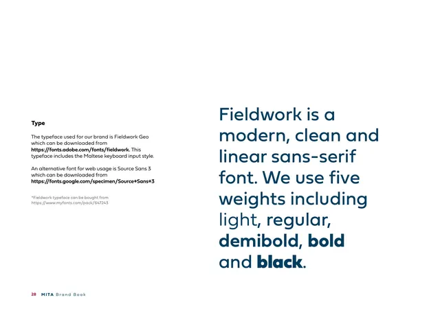
Typography page naming Fieldwork Geo as the brand typeface, with a large navy multi-weight statement showing five weights.
Summary
The "Type" page: Fieldwork Geo is named as the brand typeface (with Source Sans 3 as the web alternative), illustrated by a big navy paragraph that shows its five weights inline.
Visual description
A white page. Left column: a bold heading "Type" and body copy stating the brand typeface is Fieldwork Geo, downloadable from Adobe Fonts and including a Maltese keyboard style, with Source Sans 3 as a web alternative from Google Fonts and a note that Fieldwork can be bought from MyFonts. Right: a large navy statement, "Fieldwork is a modern, clean and linear sans-serif font. We use five weights including light, regular, demibold, bold and black." with each named weight actually set in that weight to demonstrate it. Footer: "28 MITA Brand Book".
Key takeaway
Demonstrating the type system by writing a sentence that names each weight while being set in that weight is a self-illustrating specimen, the copy is the proof. Listing the primary, web and purchase sources up front removes guesswork for implementers.
Reuse notes
A clean typography-spec page: typeface name and sources on one side, a weight-demonstrating statement on the other. Reuse the "sentence sets itself in the weights it names" trick for any multi-weight family. Note the practical detail of a localized (Maltese) keyboard variant.
From this deck: Type (Fieldwork Geo)
View deck











More like this



Keep what you find
A free account saves references to boards and can send you a weekly email of picks based on what you save.
To see every result, go Pro.