Preview image. Unlock full-res
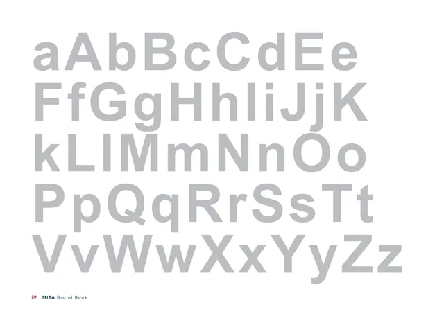
Full-bleed grayscale alphabet specimen of the Arial fallback typeface in a single light-gray tone.
Summary
A full-page grayscale alphabet specimen of the Arial fallback face, the full upper- and lowercase set in a single uniform light-gray tone.
Visual description
A white page filled with large letterforms aAbBcCdEe... through ...XxYyZz across four lines, all set in one flat light gray. The grotesque sans (Arial) shows its more uniform, less geometric character compared with the colour-alternated Fieldwork specimen earlier. No colour is used. Footer: "29 MITA Brand Book".
Key takeaway
Giving the fallback typeface its own full specimen, but in neutral gray rather than brand colours, visually demotes it below the primary face while still documenting it completely. The tonal choice signals "secondary" without a caption.
Reuse notes
Use to document a system fallback font alongside the brand face. Keeping the fallback in gray (versus the colour-coded primary) is a subtle hierarchy cue worth copying. Sits opposite the Arial usage page that follows.
From this deck: Arial alphabet specimen (grayscale)
View deck








More like this








Keep what you find
A free account saves references to boards and can send you a weekly email of picks based on what you save.
To see every result, go Pro.